Create histogram or barplot of assay, rowData or colData
Source: R/AllGenerics.R, R/plotHistogram.R
plotHistogram.RdThis methods visualizes abundances or variables from rowData or
colData.
plotHistogram(x, ...)

plotBarplot(x, ...)

# S4 method for class 'SummarizedExperiment'
plotHistogram(
  x,
  assay.type = NULL,
  features = NULL,
  row.var = NULL,
  col.var = NULL,
  ...
)

# S4 method for class 'SummarizedExperiment'
plotBarplot(
  x,
  assay.type = NULL,
  features = NULL,
  row.var = NULL,
  col.var = NULL,
  ...
)
Arguments
- x
a
SummarizedExperimentobject.- ...
Additional parameters for plotting.
layout:Character scalar. Specifies the layout of plot. Must be either"histogram"or"density". (Default:"histogram")facet.by:Character vector. Specifies variables fromcolData(x)orrowData(x)used for facetting. (Default:NULL)fill.by:Character scalar. Specifies variable fromcolData(x)orrowData(x)used for coloring. (Default:NULL)
- assay.type
NULLorcharacter scalar. Specifies the abundace table to plot. (Default:NULL)- features
NULLorcharacter vector. Ifassay.typeis specified, this specifies rows to visualize in different facets. IfNULL, whole data is visualized as a whole. (Default:NULL)- row.var
NULLorcharacter vector. Specifies a variable fromrowData(x)to visualize. (Default:NULL)- col.var
NULLorcharacter vectorSpecifies a variable fromcolData(x)to visualize. (Default:NULL)
Value
A ggplot2 object.
Details
Histogram and bar plot are a basic visualization techniques in quality
control. It helps to visualize the distribution of data. plotAbundance
allows researcher to visualise the abundance from assay, or variables
from rowData or colData. For visualizing categorical values,
one can utilize plotBarplot.
plotAbundanceDensity function is related
to plotHistogram. However, the former visualizes the most prevalent
features, while the latter can be used more freely to explore the
distributions.
Examples
data(GlobalPatterns)
tse <- GlobalPatterns
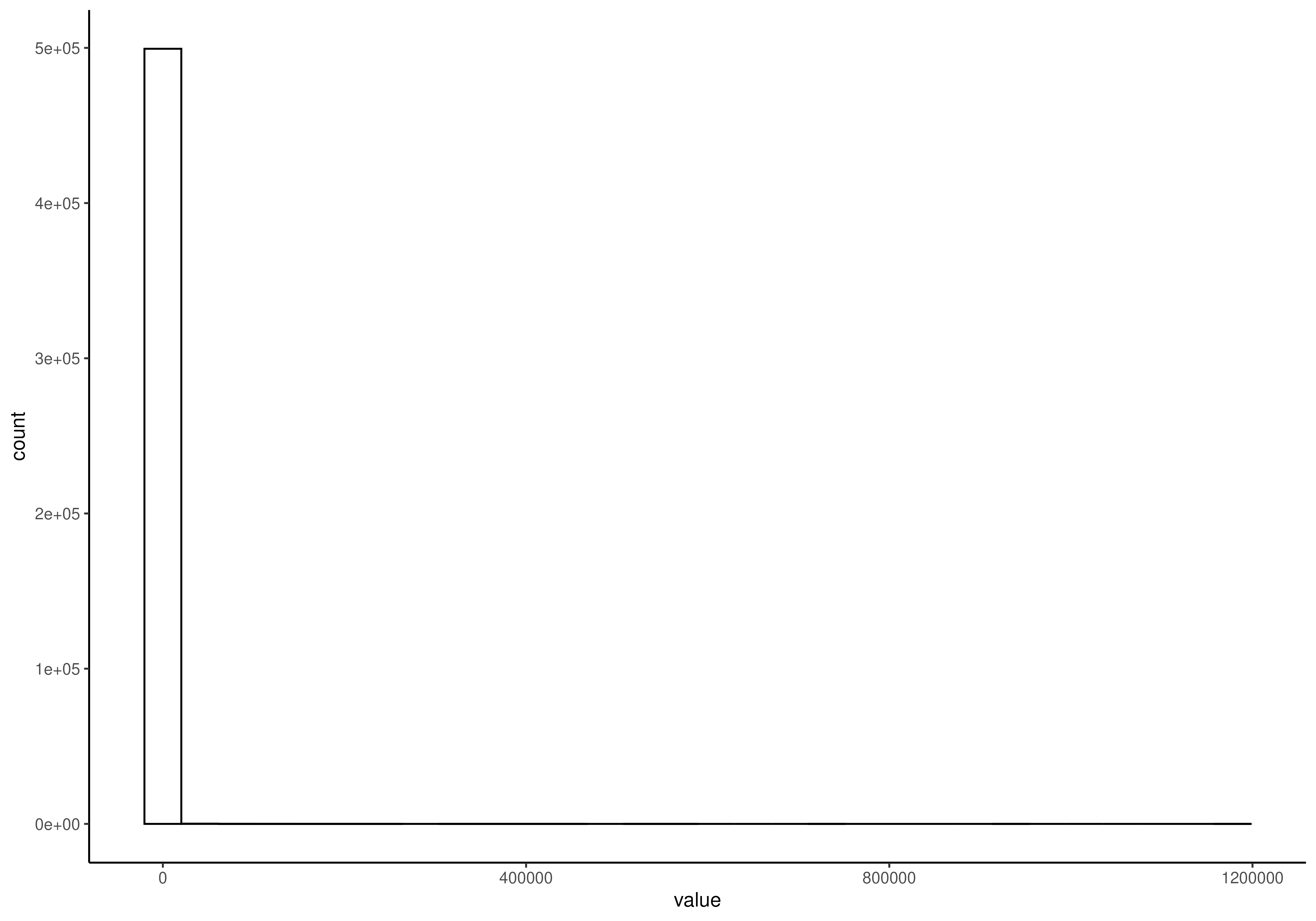
# Visualize the counts data. There are lots of zeroes.
plotHistogram(tse, assay.type = "counts")
#> `stat_bin()` using `bins = 30`. Pick better value `binwidth`.
 # Apply transformation
tse <- transformAssay(tse, method = "clr", pseudocount = TRUE)
#> A pseudocount of 0.5 was applied.
# And plot specified rows
plotHistogram(
tse,
assay.type = "clr",
features = rownames(tse)[1:5],
facet.by = "rownames"
)
#> `stat_bin()` using `bins = 30`. Pick better value `binwidth`.
# Apply transformation
tse <- transformAssay(tse, method = "clr", pseudocount = TRUE)
#> A pseudocount of 0.5 was applied.
# And plot specified rows
plotHistogram(
tse,
assay.type = "clr",
features = rownames(tse)[1:5],
facet.by = "rownames"
)
#> `stat_bin()` using `bins = 30`. Pick better value `binwidth`.
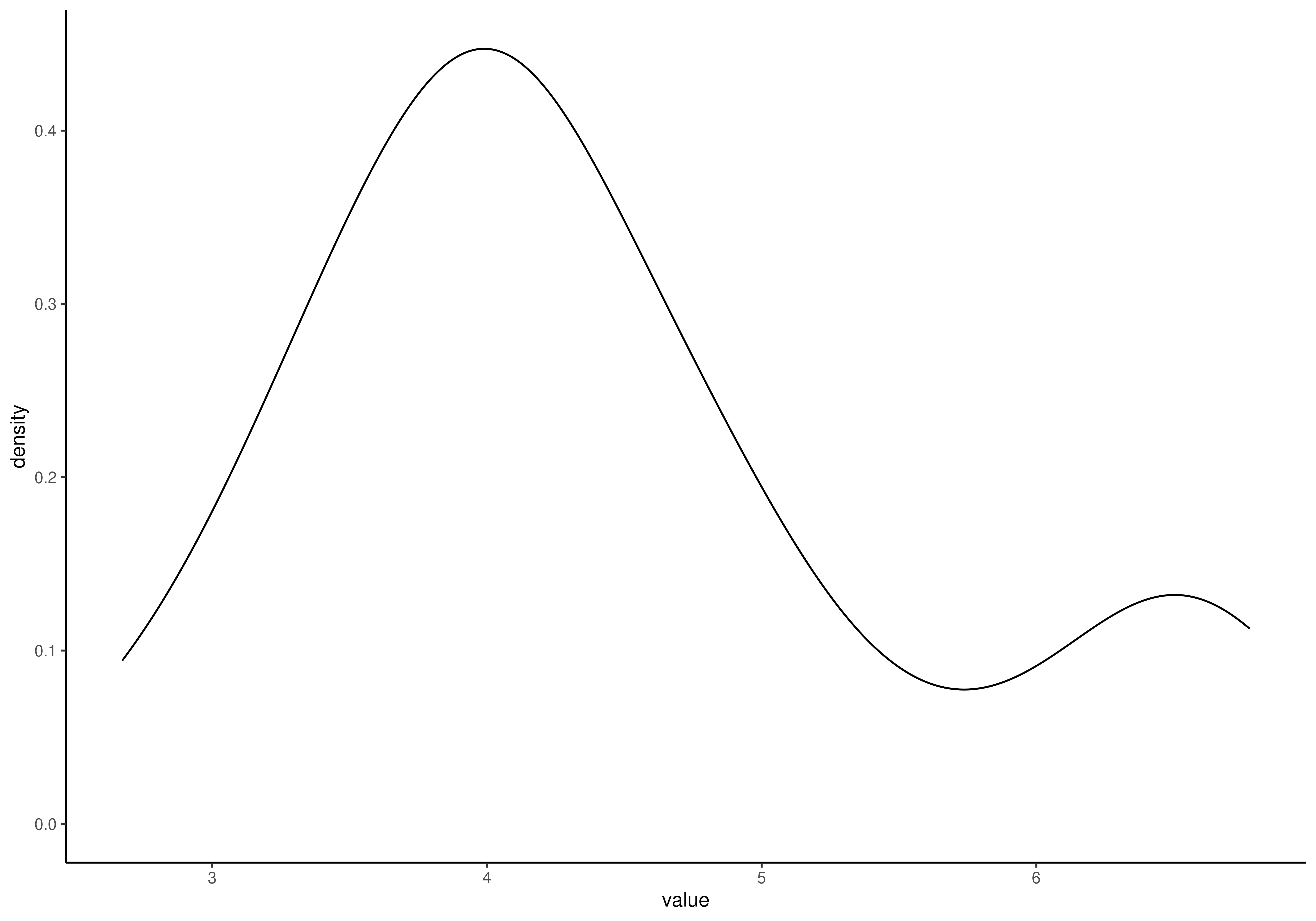
 # Calculate shannon diversity and visualize its distribution with density
# plot. Different sample types are separated with color.
tse <- addAlpha(tse, index = "shannon")
plotHistogram(
tse,
col.var = "shannon",
layout = "density",
fill.by = "SampleType"
)
# Calculate shannon diversity and visualize its distribution with density
# plot. Different sample types are separated with color.
tse <- addAlpha(tse, index = "shannon")
plotHistogram(
tse,
col.var = "shannon",
layout = "density",
fill.by = "SampleType"
)
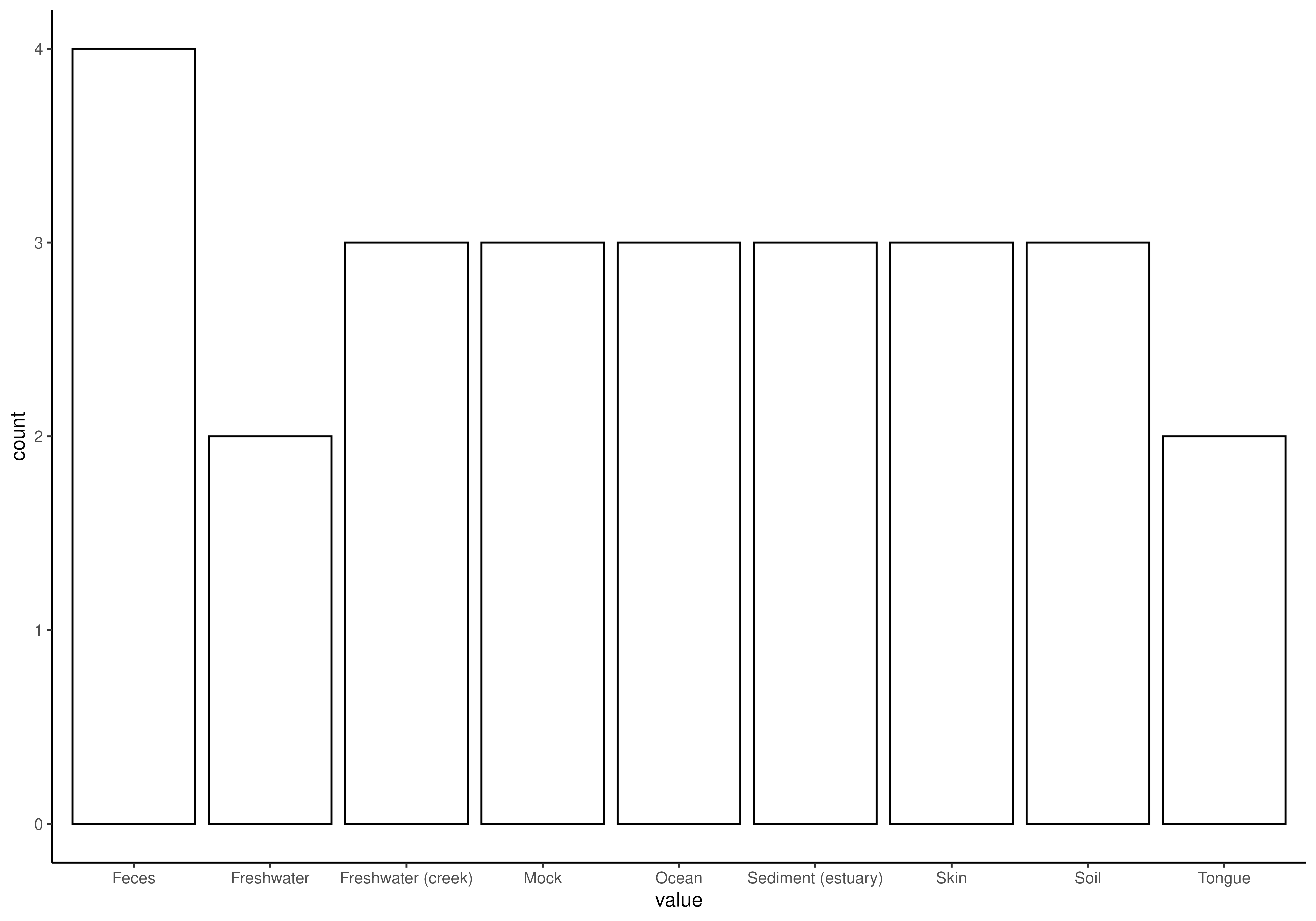
 # For categorical values, one can utilize a bar plot
plotBarplot(tse, col.var = "SampleType")
# For categorical values, one can utilize a bar plot
plotBarplot(tse, col.var = "SampleType")