
Unsupervised methods
Last updated on 2026-10-13 | Edit this page
Estimated time: 80 minutes
Overview
Questions
- How can we draw one map of the samples from several data types?
- What are the main patterns that the data types share, and which features drive them?
- How much of each data type does a shared pattern explain?
Objectives
- Explain the idea of joint RPCA and of a factor model (MOFA) in your own words.
- Create and interpret a joint ordination of two data types with joint RPCA.
- Prepare a
MultiAssayExperimentfor MOFA, and train a MOFA model. - Interpret the variance explained by each MOFA factor in each data type.
- Relate MOFA factors to the study design, and find the features with the largest weights.
- Describe what joint RPCA and MOFA show about the data.
Where are we?
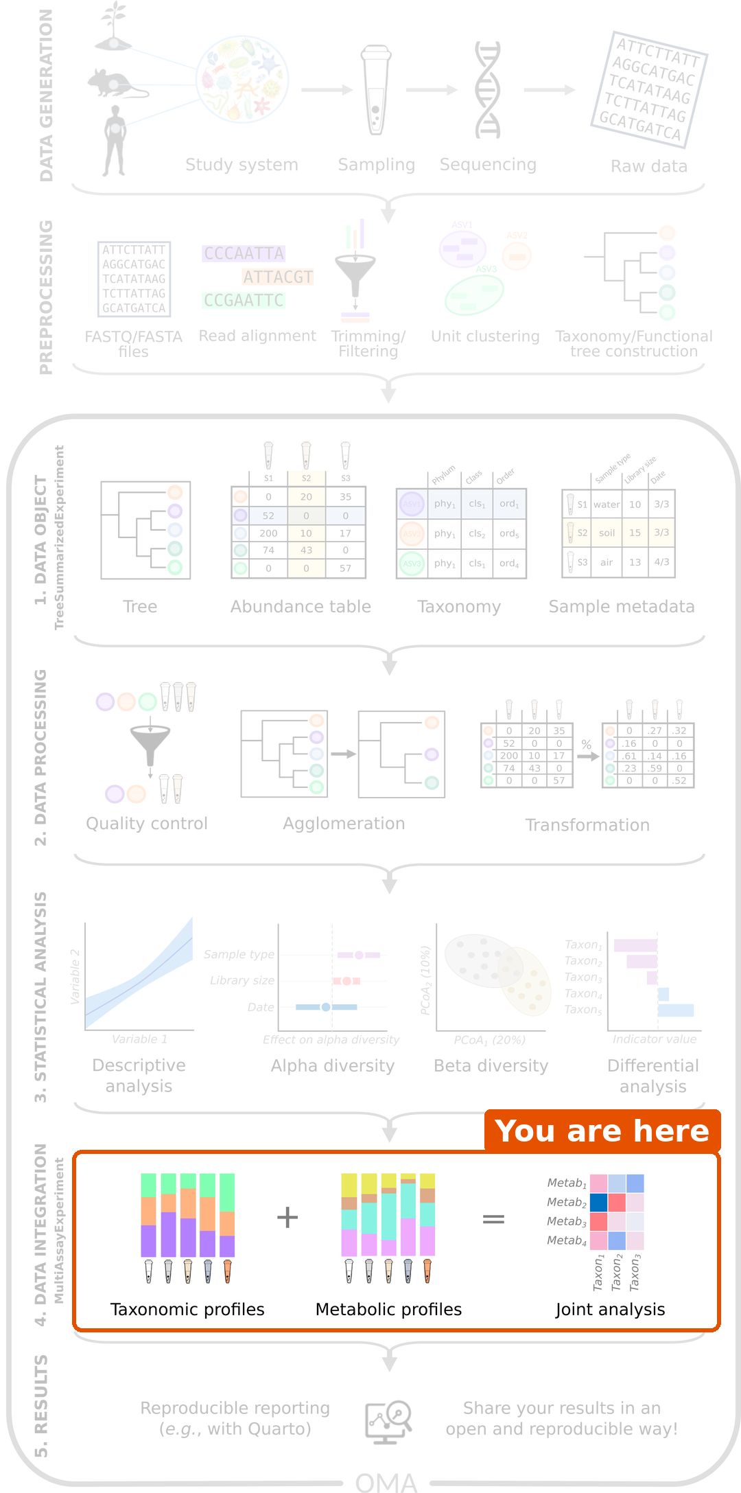
In the previous episode, we found that the microbiota and the metabolites are related, and which genera go together with which metabolites. Now we look for the main patterns that the data types share.
A PCA draws a map of the samples from one table. The unsupervised methods of this episode do the same from several tables. They do not know the diets of the rats: they look for patterns in the data alone. We then check whether the patterns match the diets.
| Method | Data types | What it gives |
|---|---|---|
| Joint RPCA | Two or more (here microbiota and metabolites) | One map of the samples, with the features that drive it |
| MOFA | Two or more (here all three) | Factors shared by some or all data types, and how much of each data type they explain |
Load packages
R
library(mia)
library(miaViz)
library(MultiAssayExperiment)
library(MOFA2)
We continue with the mae object that we prepared in episode 2.
Missing values instead of zeros
Both methods of this episode can fill in missing values themselves. We use this for the zeros of the microbiota. A zero in an abundance table often does not mean that the genus is absent; it may only be too rare to be detected. The rclr transformation cannot take the logarithm of zero.
By default, transformAssay() fills in the zeros of the
rclr table by matrix completion, using one table only. The filled-in
table is a smoothed version of the data, which would make it look too
simple to the methods of this episode. With impute = FALSE,
transformAssay() keeps the zeros as missing values
(NA), and the integration methods handle them using all
data types:
R
mae[["microbiota"]] <- transformAssay(mae[["microbiota"]],
                                      assay.type = "counts", method = "rclr",
                                      impute = FALSE, name = "rclr_noimpute")
mean(is.na(assay(mae[["microbiota"]], "rclr_noimpute")))
OUTPUT
[1] 0.0377193Result: 4 % of the values are zeros, now stored as missing values. There are few, because we kept only the prevalent genera in episode 2.
Joint RPCA
Joint RPCA (joint robust PCA; Cordazzo Vargas et al. 2026) draws one map from two or more tables. It extends robust PCA (RPCA), which was made for sparse microbiome data:
-
Robust: the method fits only the values that were
observed. The zeros (our
NAs) are not replaced by a small number; they are left out, and the method fills them in from the main patterns of the data (matrix completion). A few unusual values have less influence than in a PCA. - Joint: all tables share one set of sample coordinates, the map, but each table has its own feature loadings. The map therefore shows the variation that the tables have in common.
We give the experiments and the assay to use from each. By default,
the method keeps 20 % of the samples aside to check how well the map
works for new samples. With only 40 rats, we use all of them
(test.ratio = 0):
R
mae <- addJointRPCA(mae, experiments = c(1, 2),
                    assay.types = c("rclr_noimpute", "log10"),
                    test.ratio = 0)
The result is stored in the metadata() of the MAE under
the name JointRPCA. It is a table with the coordinates of
the rats on 3 components (ncomponents), like the result of
a PCA.
Plot the samples and the features
plotJointRPCA() from miaViz draws the map of the
samples. It also adds an arrow for the most important features of each
data type: the longer the arrow, the more the feature drives the map. A
feature points towards the samples in which it is high. We colour the
rats by diet:
R
plotJointRPCA(mae, "JointRPCA", colour.by = "Diet", ntop = 5)
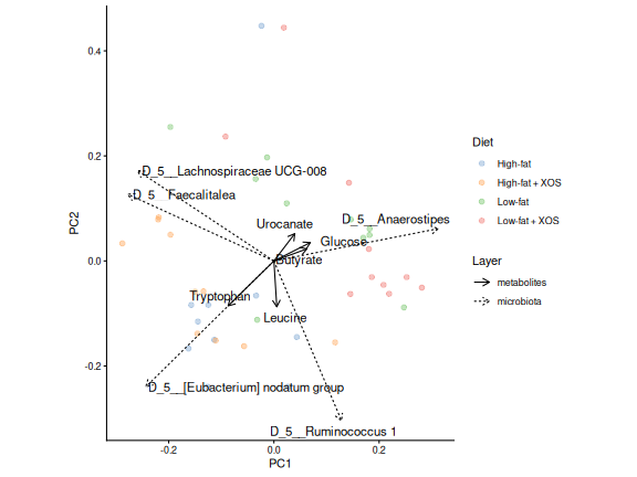
Result: without being told the diets, the joint map places most low-fat rats on the right and most high-fat rats on the left, with some overlap.
Which features drive the map?
Each feature has a loading on each axis, as in a
PCA. The loadings of all features, genera and metabolites together, are
stored with the result. plotLoadings() shows the features
with the largest loadings:
R
loadings <- attr(metadata(mae)[["JointRPCA"]], "rotation")
plotLoadings(loadings, ncomponents = 2, n = 10)
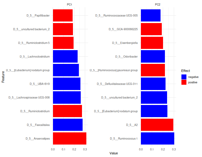
Features with a large positive loading are high in the rats on the positive side of the axis, and features with a large negative loading in the rats on the other side. Here, the top of the list is taken by genera; the biplot above shows the most important features of each data type.
Challenge 1: Read the joint RPCA
- Which metabolite has the largest loading on PC1 in the direction of
the low-fat rats? Hint: the rows of
loadingsinclude the metabolites. - Draw its box plot by
Diet, as in challenge 2 of episode 2. Does it agree with the map?
R
met <- getWithColData(mae, "metabolites")
plotBoxplot(met, assay.type = "log10", x = "Diet", features = top_met)
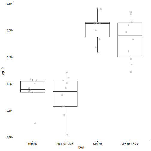
- Glucose has the largest loading in the direction of the low-fat rats.
- The box plot shows that it is indeed higher in the low-fat rats.
MOFA
MOFA (multi-omics factor analysis; Argelaguet et al. 2018, 2020) is like a PCA for several data types. It finds a small number of factors: hidden patterns that vary between the samples.
The idea of a factor model is that a few hidden variables explain much of what we measure. Think of a factor as a score for each rat, for example “how fatty was the diet”. Each feature follows this score with its own weight: a large positive weight means that the feature rises with the score, a weight near 0 means that the feature does not care. Everything that the factors do not explain is noise. MOFA prefers sparse weights, so that each factor is driven by a limited number of features.
Each factor can be shared by all data types, or be specific to one of them. For each factor, MOFA tells
- how much of the variation of each data type it explains;
- the value of each sample on the factor (like a PCA score);
- the weight of each feature (like a PCA loading).
MOFA uses all three data types, and it handles missing values: the zeros of the microbiota and the missing biomarkers.
Prepare the data
MOFA assumes roughly normally distributed values. We use the rclr values for the microbiota, the log10 values for the metabolites and the raw signals for the biomarkers.
The features are also measured on very different scales. A biomarker measured in large units would have a much larger variance than a genus, and MOFA would spend its factors on explaining it. We therefore standardize each feature (row) to mean 0 and standard deviation 1, so that every feature counts the same. We work on a copy of the MAE, so that the original stays as it is:
R
mae_mofa <- mae
mae_mofa[["microbiota"]] <- transformAssay(mae_mofa[["microbiota"]],
    assay.type = "rclr_noimpute", method = "standardize", MARGIN = "rows",
    name = "scaled")
mae_mofa[["metabolites"]] <- transformAssay(mae_mofa[["metabolites"]],
    assay.type = "log10", method = "standardize", MARGIN = "rows",
    name = "scaled")
mae_mofa[["biomarkers"]] <- transformAssay(mae_mofa[["biomarkers"]],
    assay.type = "signals", method = "standardize", MARGIN = "rows",
    name = "scaled")
MOFA uses the first assay of each experiment. We therefore keep only
the scaled assay in each of them:
R
assays(mae_mofa[["microbiota"]]) <- assays(mae_mofa[["microbiota"]])["scaled"]
assays(mae_mofa[["metabolites"]]) <- assays(mae_mofa[["metabolites"]])["scaled"]
assays(mae_mofa[["biomarkers"]]) <- assays(mae_mofa[["biomarkers"]])["scaled"]
Train the model
We create a MOFA object from the MAE.
extract_metadata = TRUE copies the sample information, so
that we can colour the plots by diet:
R
model <- create_mofa_from_MultiAssayExperiment(mae_mofa,
                                               extract_metadata = TRUE)
model
OUTPUT
Untrained MOFA model with the following characteristics:
 Number of views: 3
 Views names: microbiota metabolites biomarkers
 Number of features (per view): 57 38 39
 Number of groups: 1
 Groups names: group1
 Number of samples (per group): 40
Next we set the options. With only 40 rats, we ask for 5 factors (see the callout below):
R
model_opts <- get_default_model_options(model)
model_opts$num_factors <- 5
model <- prepare_mofa(model, model_options = model_opts)
OUTPUT
Checking data options...OUTPUT
No data options specified, using default...OUTPUT
No training options specified, using default...OUTPUT
Checking model options...Finally, we train the model. MOFA trains in Python and saves the
model to a file; we use a temporary file. The first time, it installs
its own Python environment, which is why we did it in the setup. Training prints many lines; the model is
ready when it prints Training finished.
R
model <- run_mofa(model, outfile = tempfile(fileext = ".hdf5"),
                  use_basilisk = TRUE)
WARNING
Warning in .quality_control(object, verbose = verbose): Factor(s) 3 (metabolites) are strongly correlated with the per-sample averages of the indicated omics (See 'plot_factor_mean_cor()' for more detail).
Such factors appear when there are differences in the total 'levels' between your samples, *sometimes* because of poor normalisation in the preprocessing steps.
MOFA checks the trained model and warns that one factor is strongly correlated with the per-sample averages of the metabolites. Such a factor describes rats that have higher concentrations of all metabolites, for example because the samples contained more material. This may be a technical difference rather than biology. We keep it in mind when we interpret the factors.
How many factors?
There is no single right number. A common approach is to ask for a few factors, train the model, and look at how much each factor explains (next section). Each factor is estimated from the samples, so with few samples, ask for few factors.
How much does each factor explain?
The most important MOFA plot shows how much of the variation of each data type each factor explains:
R
plot_variance_explained(model, x = "view", y = "factor")
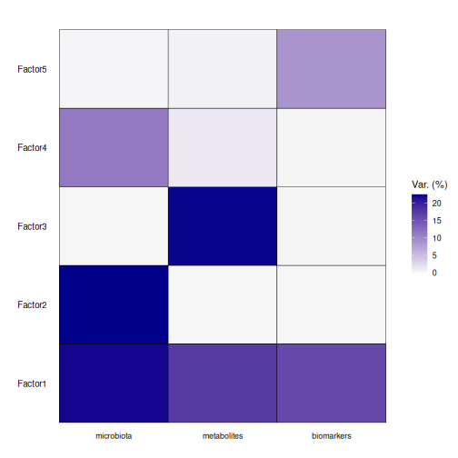
Read the heatmap row by row: a factor with dark cells in several columns is shared by those data types.
Result: factor 1 is shared by all three data types: it explains 22 % of the variation of the microbiota, 17 % of the metabolites and 16 % of the biomarkers. The other factors are mostly specific to one data type. In total, the five factors explain 54 %, 41 % and 25 % of the three data types.
What do the factors mean?
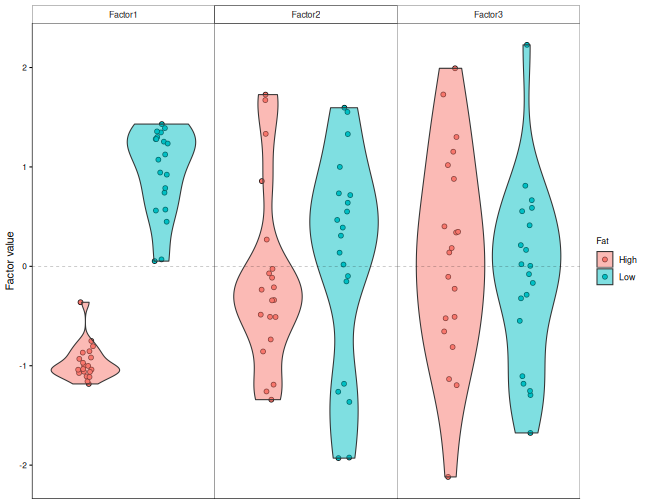
To find out what factor 1 is about, we plot the value of each rat on the factors, by diet:
R
plot_factor(model, factors = 1:3, color_by = "Fat", dodge = TRUE,
            add_violin = TRUE)
MOFA can also test the link between each factor and the sample
information. correlate_factors_with_covariates() correlates
every factor with the columns that we give, and plots the adjusted
p-values on a −log10 scale: the redder the cell, the stronger the
evidence:
R
correlate_factors_with_covariates(model, covariates = c("Fat", "XOS"),
                                  plot = "log_pval")
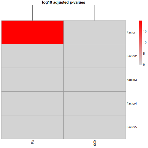
correlate_factors_with_covariates() warns that it
converts Fat and XOS to numbers (1 and 2).
With two groups, this is what we want.
Result: factor 1 separates the high-fat and the low-fat rats (adjusted p = 1.5e-20). The main pattern that the microbiota, the metabolites and the biomarkers share is the fat content of the diet.
Which features drive a factor?
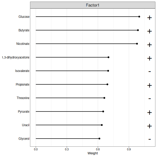
The weights tell which features drive a factor. Features with a large positive weight are high in the rats with a high factor value, and features with a large negative weight are low in them. We plot the largest weights of factor 1 in each data type. The weights are scaled so that the largest one is 1:
R
plot_top_weights(model, view = "metabolites", factors = 1, nfeatures = 10)
R
plot_top_weights(model, view = "biomarkers", factors = 1, nfeatures = 10)
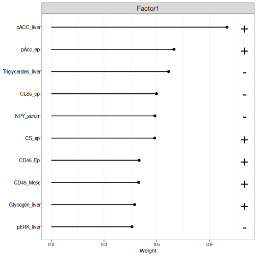
The plot shows the absolute weights; a + or
− sign next to each feature tells the direction. The
high-fat rats have negative values on factor 1, so the features with a −
sign are higher in the high-fat rats.
Challenge 2: The genera of factor 1
- Plot the ten genera with the largest weights on factor 1.
- Which genera are higher in the high-fat rats, and which in the low-fat rats?
- Does factor 1 agree with the joint RPCA? Compare the genera with the loadings plot of the joint RPCA.
R
plot_top_weights(model, view = "microbiota", factors = 1, nfeatures = 10)
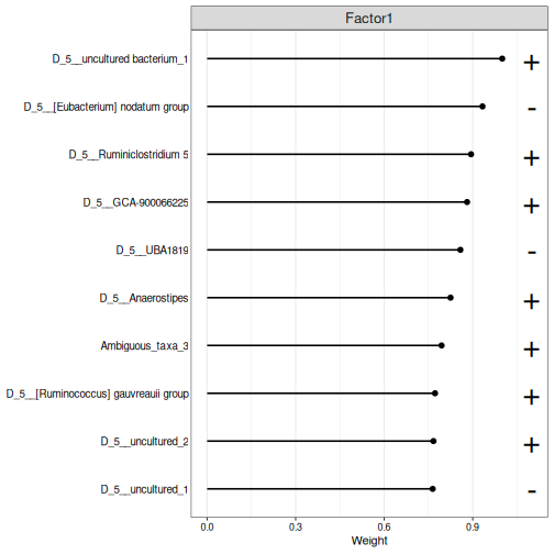
The high-fat rats have negative values on factor 1, so the genera with a − sign are higher in the high-fat rats, and the others in the low-fat rats. Several of the same genera, such as Anaerostipes, also drive the first joint RPCA axis: the two methods find the same main pattern, the fat in the diet.
Challenge 3: Is there an XOS factor?
The study was designed to test the effect of XOS.
- Plot the values of the rats on all five factors, coloured by
XOS. Does any factor separate the rats with and without XOS? - Look again at the output of
correlate_factors_with_covariates(). Is any factor significantly correlated withXOS? - Why might an unsupervised method miss the effect of XOS?
R
plot_factor(model, factors = 1:5, color_by = "XOS", dodge = TRUE,
            add_violin = TRUE)
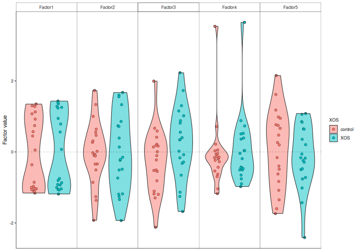
No factor separates the XOS groups, and no factor is significantly correlated with XOS.
An unsupervised method looks for the largest patterns in the data. Here, the fat in the diet dominates, and the smaller effect of XOS is hidden by it and by the differences between individual rats. To look for the features that tell the XOS groups apart, we need a supervised method, the topic of the next episode.
Two views of the same data
Joint RPCA and MOFA both look for patterns that several data types share, and in our data both find the same main pattern: the fat in the diet. They show the results in different ways:
- Joint RPCA gives one map of the samples, shared by all data types, with the loadings of all features.
- MOFA gives factors, and tells how much of each data type each factor explains, so that a factor can be shared by all data types or be specific to one.
Both are active areas of development. Try more than one method, and trust the patterns that they agree on.
References
- Cordazzo Vargas B. et al. (2026) Joint-RPCA: domain-aware multi-omics integration for systems microbiology. Molecular Systems Biology. doi:10.1038/s44320-026-00236-3
- Argelaguet R. et al. (2018) Multi-Omics Factor Analysis — a framework for unsupervised integration of multi-omics data sets. Molecular Systems Biology 14: e8124.
- Argelaguet R. et al. (2020) MOFA+: a statistical framework for comprehensive integration of multi-modal single-cell data. Genome Biology 21: 111.
- Unsupervised integration methods find the main patterns that several data types share, without knowing the study groups.
- Use rclr with
impute = FALSE, so that the integration methods handle the zeros themselves. - Joint RPCA (
addJointRPCA()) draws one map of the samples from two or more data types;plotJointRPCA()shows the samples and the features that drive the map. - MOFA is a factor model: a few hidden factors, shared by all data types or specific to one, explain the data. Standardize the features, and ask for few factors when there are few samples.
-
plot_variance_explained()shows how much of each data type each factor explains, andplot_top_weights()the features that drive it. - Joint RPCA and MOFA show the shared patterns in different ways; in our data they agree.
- In our study, the main shared pattern is the fat in the diet. Smaller effects, such as XOS, can be hidden by larger ones.