All Images
Introduction to multi-omics
Figure 1
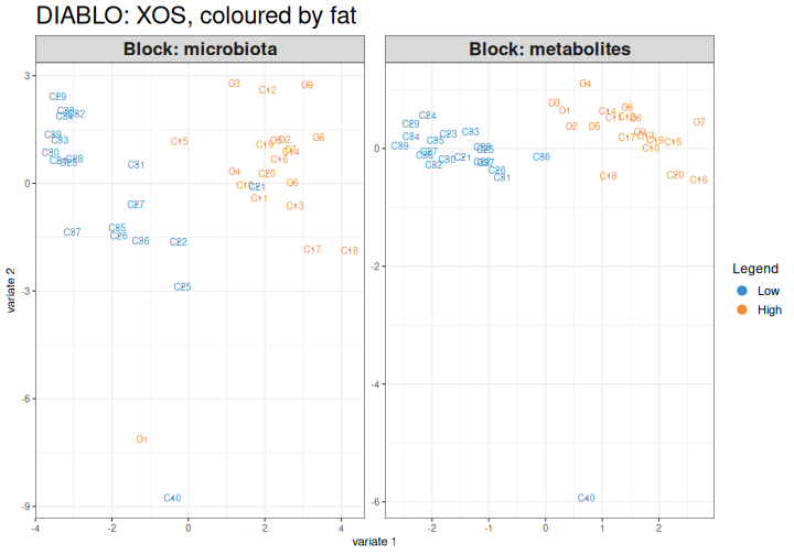
Image 1 of 1: ‘Microbiome data science workflow with the data integration step highlighted: taxonomic profiles and metabolic profiles are combined in a joint analysis.’
MultiAssayExperiment and the study data
Figure 1
Image 1 of 1: ‘Microbiome data science workflow with the data integration step highlighted: taxonomic profiles and metabolic profiles are combined in a joint analysis.’
Figure 2
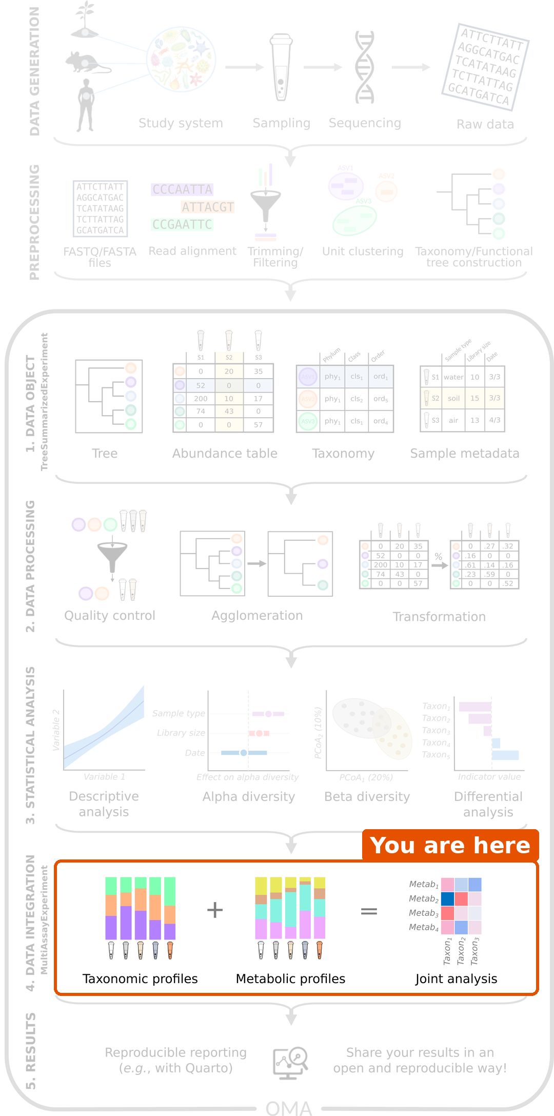
Image 1 of 1: ‘Diagram of a MultiAssayExperiment. On the left, several experiments are stacked; each is a table of features by observations. At the top, colData holds one row per subject (patient). On the right, sampleMap is a table with the columns assay, primary and colname, which links each observation in each experiment to a subject in colData.’
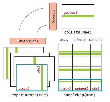
Figure 3
Image 1 of 1: ‘Box plots of the log10 concentrations of butyrate, acetate and propionate in the four diet groups.’
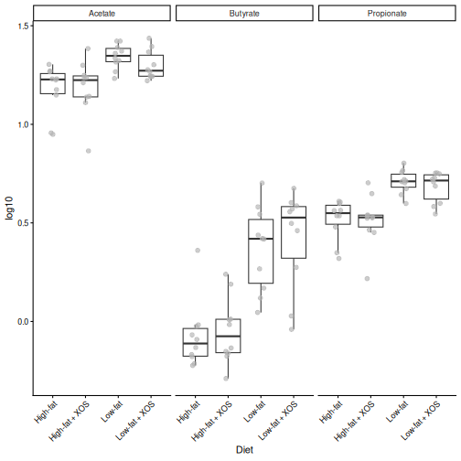
Figure 4
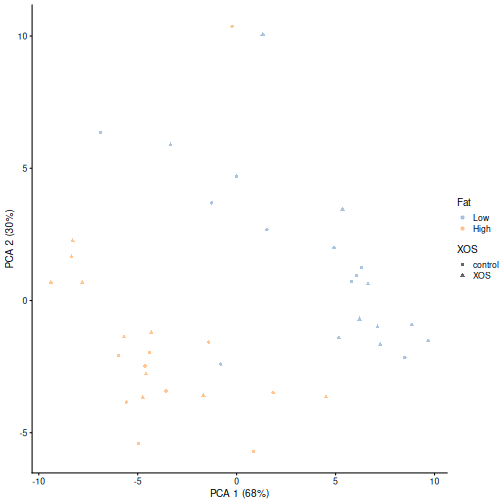
Image 1 of 1: ‘PCA plot of the rats based on the rclr-transformed genus abundances, coloured by fat in the diet and shaped by XOS. The high-fat and low-fat rats are separated along the first axis.’
Exploratory methods
Figure 1
Image 1 of 1: ‘Microbiome data science workflow with the data integration step highlighted: taxonomic profiles and metabolic profiles are combined in a joint analysis.’
Figure 2
Image 1 of 1: ‘Histogram of the Mantel correlations of 999 permutations of the data, centred around zero. A red vertical line marks the observed correlation, which lies in the right tail of the histogram.’
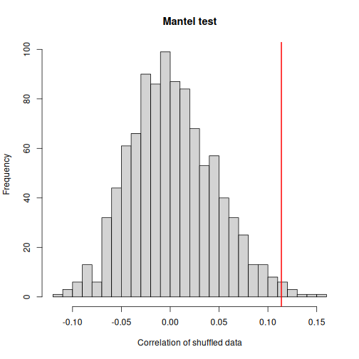
Figure 3
Image 1 of 1: ‘Lollipop plot of the share of variation explained by the microbiota (R2) for the 15 metabolites with the highest values, highest at the bottom. Glucose, butyrate and nicotinate have much higher values (around 0.2) than the others.’
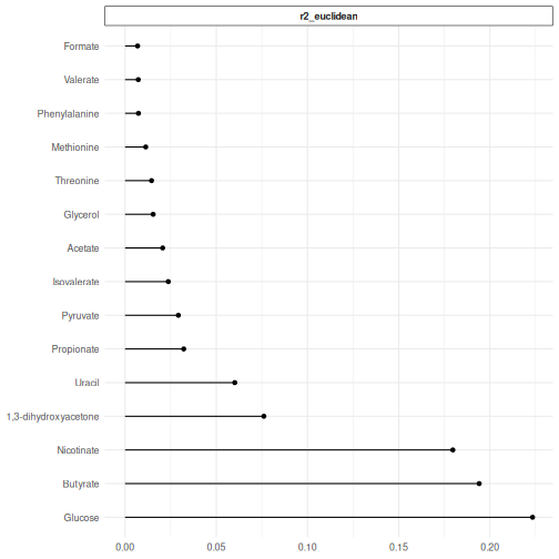
Figure 4
Image 1 of 1: ‘Heatmap of the associations between the 20 most abundant genera (columns) and the 38 metabolites (rows), red for positive and blue for negative. Groups of genera share the same pattern: one group is positively associated with glucose, butyrate and nicotinate, and another group negatively.’
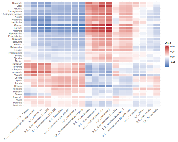
Figure 5
Image 1 of 1: ‘Heatmap of the Spearman correlations between the 20 most abundant genera and the 38 metabolites.’
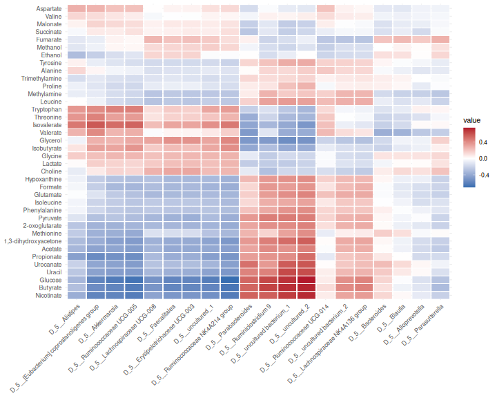
Figure 6
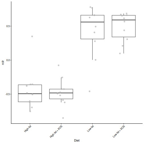
Image 1 of 1: ‘Box plots of the rclr abundance of the genus most positively associated with butyrate in the four diet groups. It is higher in the low-fat groups.’
Unsupervised methods
Figure 1
Image 1 of 1: ‘Microbiome data science workflow with the data integration step highlighted: taxonomic profiles and metabolic profiles are combined in a joint analysis.’
Figure 2
Image 1 of 1: ‘Joint RPCA biplot of the rats, coloured by diet, with arrows for the five most important genera and metabolites. The high-fat rats are mostly on one side of the first axis and the low-fat rats on the other, with some overlap.’
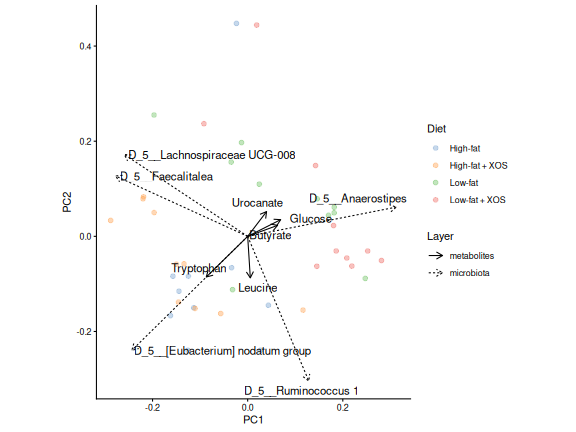
Figure 3
Image 1 of 1: ‘Bar plots of the ten features with the largest absolute loadings on the first two joint RPCA axes, coloured by the sign of the loading.’
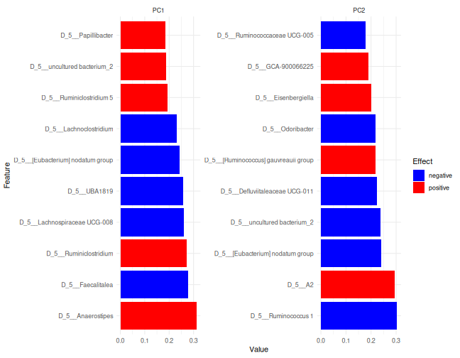
Figure 4
Image 1 of 1: ‘Box plots of the log10 concentration of the metabolite with the largest loading towards the low-fat rats, in the four diet groups. It is higher in the low-fat groups than in the high-fat groups.’
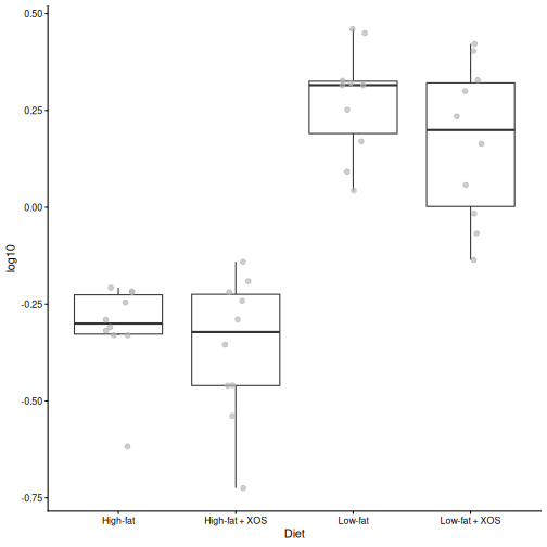
Figure 5
Image 1 of 1: ‘Heatmap of the percentage of variance explained by each of the five MOFA factors (rows) in each data type (columns). Factor 1 explains variance in all three data types; factors 2 and 4 mainly the microbiota, factor 3 the metabolites and factor 5 the biomarkers.’
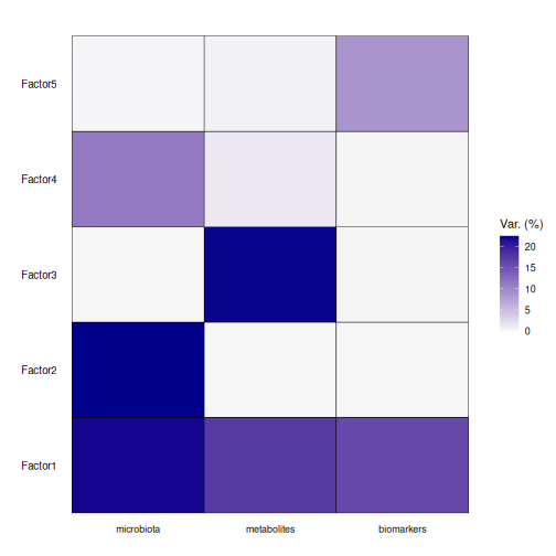
Figure 6
Image 1 of 1: ‘Violin plots of the values of the rats on MOFA factors 1 to 3, coloured by fat in the diet. On factor 1, the high-fat and low-fat rats are completely separated; on factors 2 and 3 they overlap.’
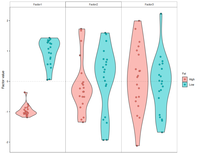
Figure 7
Image 1 of 1: ‘Heatmap of the minus log10 adjusted p-values of the correlation between each MOFA factor (rows) and the fat in the diet and XOS (columns). Only factor 1 and fat has a strong signal.’
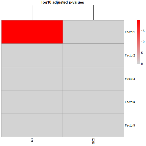
Figure 8
Image 1 of 1: ‘Lollipop plot of the ten metabolites with the largest absolute weights on MOFA factor 1. Glucose, butyrate and nicotinate have the largest weights, all with a plus sign; isovalerate, threonine and glycerol have a minus sign.’
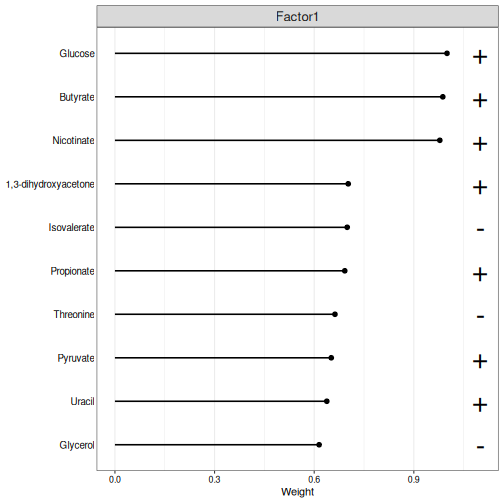
Figure 9
Image 1 of 1: ‘Lollipop plot of the ten biomarkers with the largest absolute weights on MOFA factor 1. pACC_liver has the largest weight, with a plus sign; Triglycerides_liver, CLSs_epi, NPY_serum and pERK_liver have a minus sign.’
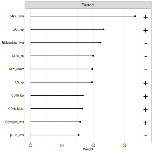
Figure 10
Image 1 of 1: ‘Lollipop plot of the ten genera with the largest absolute weights on MOFA factor 1, with plus or minus signs. Uncultured bacterium 1 has the largest weight.’
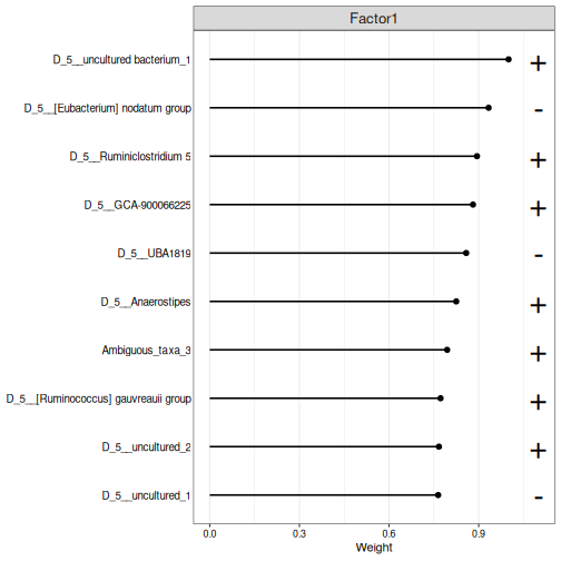
Figure 11
Image 1 of 1: ‘Violin plots of the values of the rats on the five MOFA factors, coloured by XOS. On every factor, the rats with and without XOS overlap.’
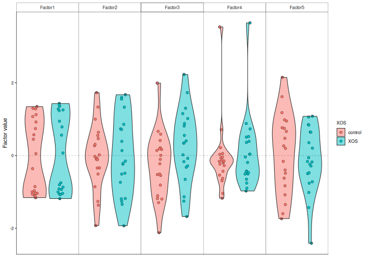
Supervised methods
Figure 1
Image 1 of 1: ‘Microbiome data science workflow with the data integration step highlighted: taxonomic profiles and metabolic profiles are combined in a joint analysis.’
Figure 2
Image 1 of 1: ‘Diagram of three data fusion strategies. Early fusion: the tables of all views are joined side by side into one table, and one model is trained on it. Intermediate fusion: a model is trained on each view, their outputs are joined, and one more model is trained on them. Late fusion: a model is trained on each view, and their predictions are combined into one final prediction. On the right, the outputs for continuous, binary, multiclass and survival outcomes; at the bottom, uncertainty estimation, feature importance, cross-validation and dimensionality reduction.’
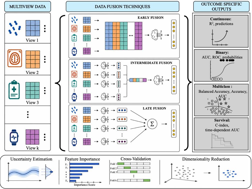
Figure 3
Image 1 of 1: ‘ROC curves of the five IntegratedLearner models for predicting a high-fat diet: one per data type, the stacked model and the concatenated model. All curves go almost straight up to a true positive rate of 1; only the microbiota curve (AUC 0.96) bends slightly.’
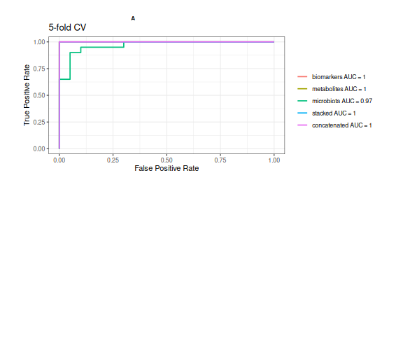
Figure 4
Image 1 of 1: ‘Two scatter plots of the rats, shown by their sample names, on the first two DIABLO components, one based on the microbiota and one on the metabolites, coloured by fat in the diet. In both, the high-fat and low-fat rats are clearly separated along the first component.’
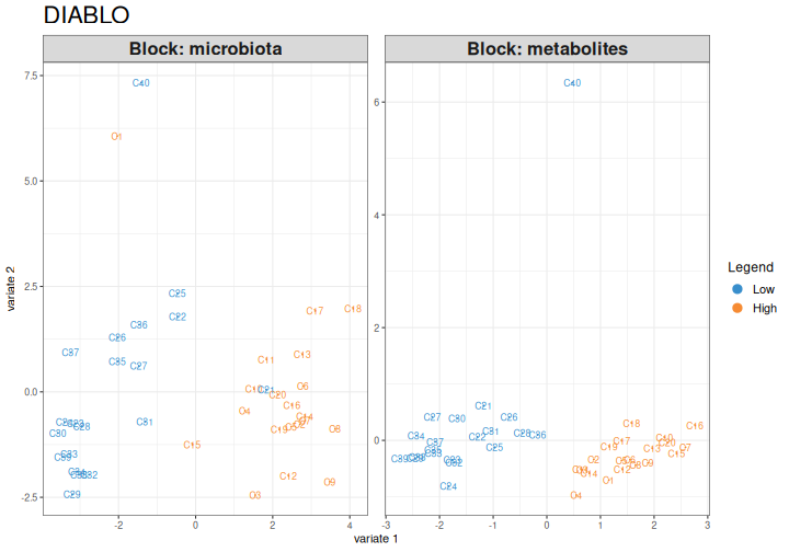
Figure 5
Image 1 of 1: ‘Bar plots of the loadings of the ten genera and five metabolites selected on the first DIABLO component, coloured by the diet group in which each feature is highest. All five metabolites (glucose, nicotinate, butyrate, 1,3-dihydroxyacetone and uracil) are highest in the low-fat rats; the genera are split between the two groups.’
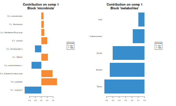
Figure 6
Image 1 of 1: ‘Circos plot of the genera and metabolites selected on the two components, arranged in a circle. Lines inside the circle connect pairs of features with a correlation above 0.7, red for positive and blue for negative correlations. Glucose, nicotinate and butyrate have many lines to the genera.’
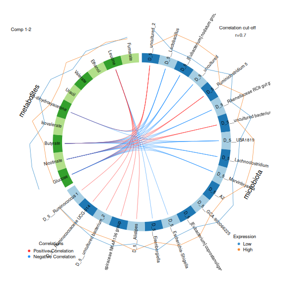
Figure 7
Image 1 of 1: ‘Two scatter plots of the rats on the first two DIABLO components for XOS, one per data type, coloured by XOS. The groups overlap.’
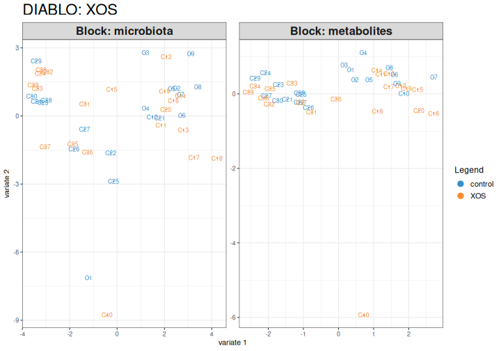
Figure 8
Image 1 of 1: ‘The same two scatter plots of the DIABLO components for XOS, now coloured by fat in the diet. The high-fat and low-fat rats are largely separated along the first component.’