9 Community Typing
Community typing in microbial ecology involves identifying distinct microbial communities by recognizing patterns in the data. The community types are described based on taxa characteristics, representing each community. The samples are described by community type assignments, which are defined by the ecosystem features in the sample. Community typing techniques can typically be divided into unsupervised clustering and dimensionality reduction techniques, where clustering is more commonly in use.
In this chapter, we first walk you through some common clustering schemes in use for microbial community ecology, and then focus in more detailed community typing techniques based on data dimensionality reduction.
9.1 Clustering
Clustering techniques aim to find groups, called clusters, that share a pattern in the data. In the microbiome context, clustering techniques are included in microbiome community typing methods. For example, clustering allow samples to be distinguished from each other based on their microbiome community composition. Clustering scheme consists of two steps, the first is to compute the sample dissimilarities with a given distance metrics, and the second is to form the clusters based on the dissimilarity matrix. The data can be clustered either based on features or samples. The examples below are focused on sample clustering.
There are multiple clustering algorithms available. bluster is a Bioconductor package providing tools for clustering data in the SummarizedExperiment container. It offers multiple algorithms such as hierarchical clustering, DBSCAN, and K-means.
# Load dependencies
library(bluster)
library(kableExtra)
In the examples of this chapter we use peerj13075 data for microbiota community typing. This chapter illustrates how different results can be obtained depending on the choice of the algorithm. To reduce calculation time we decided to agglomerate taxa onto ‘Class’ level and filter out the least prevalent taxa as well as less commonly detected within a sample resulting in 25 features in the data.
library(mia)
data("peerj13075", package = "mia")
tse <- peerj13075

# Filter out most taxa to ease the calculation
altExp(tse, "prevalent") <- agglomerateByPrevalence(tse, rank = "class",
                                                    prevalence = 20/100,
                                                    detection = 1/100)
9.1.1 Hierarchical clustering
The hierarchical clustering aims to find hierarchy between samples/features. There are two approaches: agglomerative (“bottom-up”) and divisive (“top-down”). In agglomerative approach, each observation is first in a unique cluster, after which the algorithm continues to agglomerate similar data points into clusters. The divisive approach, instead, starts with one cluster that contains all observations. Clusters are split recursively into clusters that differ the most. The clustering can be continued until each cluster contains only one observation.
In this example we use addCluster function from mia to cluster the data. addCluster function allows to choose a clustering algorithm and offers multiple parameters to shape the result. HclustParam() parameter is chosen for hierarchical clustering. HclustParam() parameter itself has parameters on its own HclustParam documentation. A parameter, by defines whether to cluster features or samples. Here we cluster counts data, for which we compute the dissimilarities with the Bray-Curtis distance. Here, again, we use ward.d2 metohod. Returning statistical information can chosen by using full parameter. Finally, the clust.col parameter allows us to choose the name of the column in the colData (default name is clusters).
library(vegan)

set.seed(123)
altExp(tse, "prevalent") <- addCluster(altExp(tse, "prevalent"),
               assay.type = "counts",
               by = "cols",
               HclustParam(method = "ward.D2",
                           dist.fun = vegdist,
                           metric = "bray"),
               full = TRUE,
               clust.col = "hclust")

table(altExp(tse, "prevalent")$hclust)
##
##   1  2  3  4  5  6
##  13  5  8 16 11  5
Hierarchical clustering suggests six clusters to describe the data.
Now, we visualize the hierarchical structure of the clusters with a dendrogram tree. In dendrograms, the tree is split where the branch length is the largest. In each splitting point, the tree is divided into two clusters leading to the hierarchy. In this example, each sample is labelled by their dominant taxon to visualize ecological differences between the clusters.
library(dendextend)

# Get hclust data from metadata
hclust_data <- metadata(altExp(tse, "prevalent"))$clusters$hclust

# Get the dendrogram object
dendro <- as.dendrogram(hclust_data)
k <- length(unique(altExp(tse, "prevalent")$hclust))

# Color the branches by clusters
cols <- scales::hue_pal()(k)

# Order the colors to be equivalent to the factor levels
cols <- cols[c(1,4,5,3,2,6)]
dend <- color_branches(dendro, k = k, col = unlist(cols))

# Label the samples by their dominant taxon
altExp(tse, "prevalent") <- addDominant(altExp(tse, "prevalent"))
labels(dend) <- altExp(tse, "prevalent")$dominant_taxa
dend <- color_labels(dend, k = k, col = unlist(cols))

# Plot dendrogram
par(mar=c(9, 3, 0.5, 0.5))
dend %>% set("labels_cex", 0.8) %>% plot()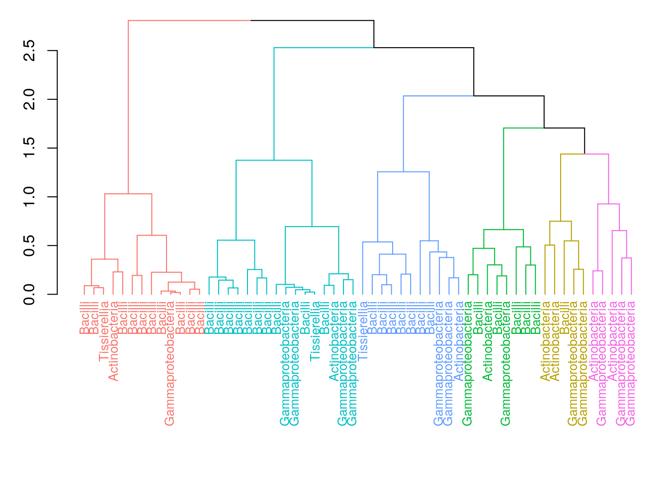
We can also visualize the clusters by by projecting the data onto two-dimensional surface that captures the most variability in the data. In this example, we use multi-dimensional scaling (MDS).
plotReducedDim(altExp(tse, "prevalent"), "MDS", theme_size = 13) +
              geom_point(size = 3, alpha = 0.6,
                      aes(color = altExp(tse, "prevalent")$hclust)) +
              labs(color = "HClust", title = "Hclust") + theme_minimal()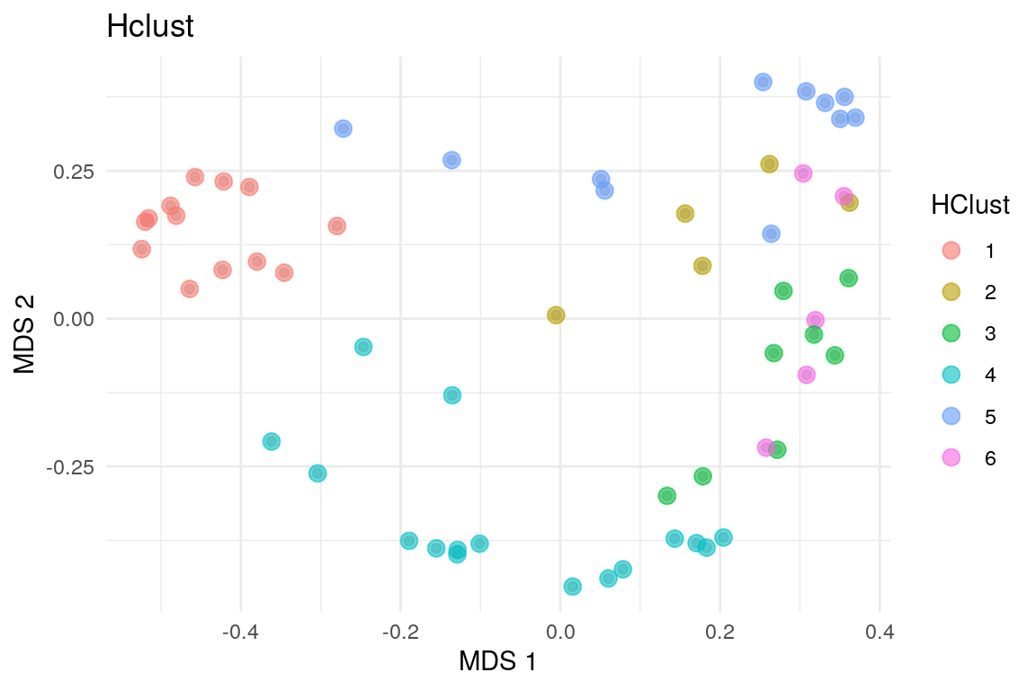
9.1.2 Dirichlet Multinomial Mixtures (DMM)
This section focuses on Dirichlet-Multinomial Mixture Model analysis. It is a Bayesian clustering technique that allows to search for sample patterns that reflect sample similarity in the data using both prior information and the data.
In this example, we cluster the data with DMM clustering. In the example below, we calculate model fit using Laplace approximation ro reduce the calculation time. The cluster information is added in the metadata with an optional name. In this example, we use a prior assumption that the optimal number of clusters to describe the data would be in the range from 1 to 6.
# Run the model and calculates the most likely number of clusters from 1 to 6
set.seed(123)
altExp(tse, "prevalent") <- addCluster(altExp(tse, "prevalent"),
                                      assay.type = "counts",
                                      name = "DMM",
                                      DmmParam(k = 1:6, type = "laplace"),
                                      MARGIN = "samples",
                                      full = TRUE,
                                      clust.col = "dmmclust")
The plot below represents the Laplace approximation to the model evidence for each of the six models. We can see that the best number of clusters is two, as the minimum value of Laplace approximation to the negative log model evidence for DMM models as a function of k, determines the optimal k. The optimal k suggests to fit a model with k mixtures of Dirichlet distributions as a prior.
library(miaViz)
p <- plotDMNFit(altExp(tse, "prevalent"), type = "laplace", name = "DMM")
p + theme_minimal(base_size = 11)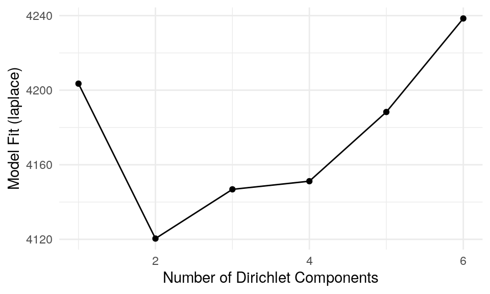
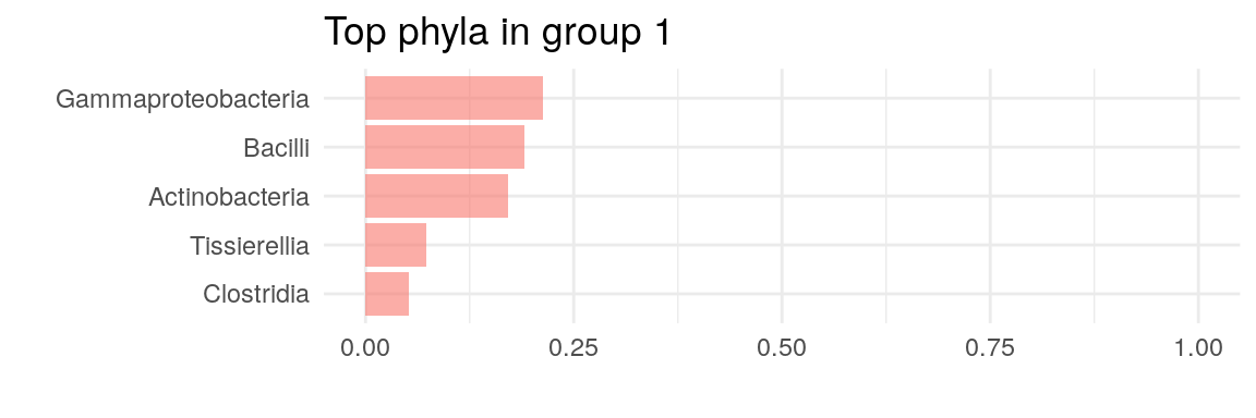
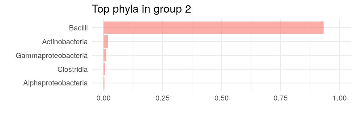
The plot above suggests that two clusters describe the data the best. Now we can plot, which taxa define the key cluster features.
# Get the estimates on how much each phyla contributes on each cluster
best_model <- metadata(altExp(tse, "prevalent"))$DMM$dmm[2]
drivers <- as.data.frame(best_model[[1]]@fit$Estimate)

# Clean names
drivers$class <- rownames(drivers)

for (i in 1:2) {
  # Transfer to relative to optimize plotting
  drivers[i] <- drivers[i]/sum(drivers[i])

  drivers <- drivers[order(drivers[[i]], decreasing = TRUE),]
  p <- ggplot(head(drivers, 5),
              aes(x = reorder(head(class, 5), +
                    head(drivers[[i]], 5)),
                    y = head(drivers[[i]], 5))) +
              geom_bar(stat = "identity",
                    fill = scales::hue_pal()(1),
                    alpha = 0.6) +
                    coord_flip() +
                    labs(title = paste("Top phyla in group", i)) +
                    theme_minimal(base_size = 11) +
                    labs(x="", y="") +
                    scale_y_continuous(limits=c(0,1))
  print(p)
}
As well as in hierarchical clustering, we can also visualize the clusters by projecting the data onto two-dimensional surface calculated using MDS. The plot rather clearly demonstrates the cluster division.
# DMM clusters
plotReducedDim(altExp(tse, "prevalent"), "MDS", theme_size = 13) +
              geom_point(size = 3, alpha = 0.6,
                      aes(color = altExp(tse, "prevalent")$dmmclust)) +
              labs(color = "DMMclust", title = "DMM") + theme_minimal()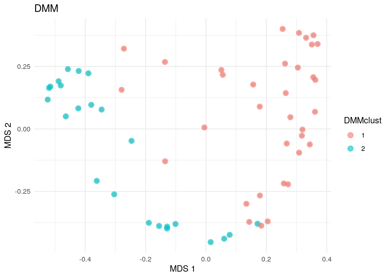
9.2 Dimensionality reduction
Dimensionality reduction can be considered as a part of community typing, where the aim is to find underlying structure in the data. Dimensionality reduction relies in the idea that the data can be describe in a lower rank representation, where latent features with different loads of the observed ones describe the sample set. This representation stores the information about sample dissimilarity with significantly reduced amount of data dimensions. Unlike clustering, where each sample is assigned into one cluster, dimensionality reduction allows continuous memberships for all samples into all community types. Dimensionality reduction techniques are explained in chapter Chapter 7 in more detail.
9.2.1 Non-negative matrix factorization
In this section, we will particularly focus on Non-negative Matrix Factorization (NMF). NMF decomposes the original data X into two lower rank matrices: H representing key taxa characteristics of each community type and W representing continuous sample memberships across all community types. NMF algorithm calculates the minimum distance between the original data and it’s approximation using Kullback-Leibler divergence.
Here, we use functions in NMF package. To reduce calculation time, we set the number of components in four instead of optimizing the number of components that describe the original data the best.
# Pick low-rank representations
H <- res@fit@H
W <- res@fit@W

# Add NMF loadings in the metadata
metadata(altExp(tse, "prevalent"))$NMF_loadings <- H

# Obtain the relative abundance of ES in each sample
wrel <- t(apply(W, 1, function (x) {x/sum(x)}))

# Define the community type of a sample with the highest relative abundance
altExp(tse, "prevalent")$NMFcomponent <- as.factor(apply(wrel, 1, which.max))
table(altExp(tse, "prevalent")$NMFcomponent)
##
##   1  2  3  4
##  11 14 28  5
Now, we can plot the NMF community types calculated based on maximum membership for each sample onto a two-dimensional surface.
# NMF community types
plotReducedDim(altExp(tse, "prevalent"), "MDS", theme_size = 13) +
              geom_point(size = 3, alpha = 0.6,
                      aes(color = altExp(tse, "prevalent")$NMFcomponent)) +
              labs(color = "NMFcomponent", title = "NMF") + theme_minimal()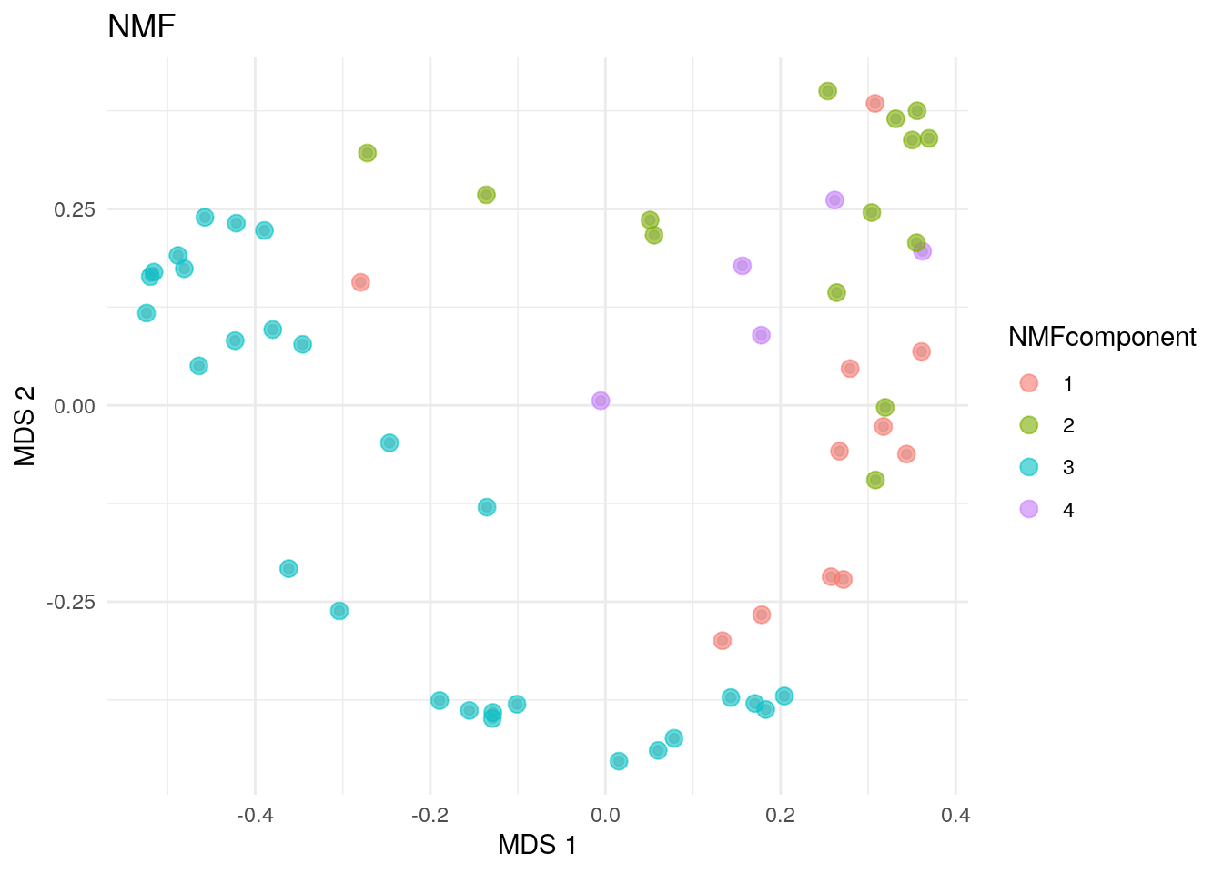
9.3 Additional Community Typing
For more community typing techniques applied to the ‘SprockettTHData’ data set, see the attached .Rmd file.
Link: