21 Machine learning
21.1 Background
Machine learning (ML) is a branch of artificial intelligence. While there are several definitions of machine learning, they generally involve using computational methods (i.e., machines) to identify patterns in data (i.e., learning).
Machine learning can be divided into supervised and unsupervised learning. Supervised ML is used to predict outcomes based on labeled data, whereas unsupervised ML is used to discover unknown patterns and structures within the data.
21.1.1 Unsupervised machine learning
“Unsupervised” means that the outcomes (e.g., patient status) are not known by the model during its training, and patterns are learned based solely on the data, such as an abundance table.
Common tasks in unsupervised machine learning include dimension reduction and clustering, tasks discussed in Chapter 14 and Chapter 15, respectively.
21.1.2 Supervised machine learning
“Supervised” means that a model is trained on observations paired with a known output (e.g., patient status: healthy or diseased). During training, the model learns patterns from a portion of the data and it is then evaluated on its ability to generalize to new data. This process involves splitting the collected data into a training and testing sets, commonly in 80/20 ratio, although other proportions can be used depending on the size and applications of the dataset.
Training is usually enhanced with cross-validation to improve the model’s robustness. However, when the dataset is small, splitting it into training and test sets might not be feasible. In such cases, cross-validation alone can be used to provide a rough estimate of the model’s performance. This strategy involves dividing the data into K folds (or subsets) of similar size. The model is then trained on K-1 folds, and tested on the remaining fold. This process is repeated K times, allowing each fold to serve as the test set once. While this approach is not as reliable as having a separate test set, it can still give valuable insights into how well the model might perform on new data.
Common tasks for supervised machine learning includes classification (e.g., predict categorical variables) and regression (e.g., predicting continuous variables). This chapter discusses two supervised ML algorithms that can be applied to classification and regression tasks.
ML applications for the integration of multi-omic datasets are covered in Chapter 20 and ?sec-multi-omics-integration
21.2 Setup
Published fecal microbiome data (Qin et al. 2012) will be used to illustrate how to deploy supervised machine learning algorithms to address classification and regression problems. For classification, two ML models will be used to classify subjects in two groups: Type II diabetes patients or Healthy individuals (encoded as T2D and healthy in the metadata). For regression, models will be use to predict the body mass index (BMI) of each subject. In both tasks the models will be trained with participants gut microbiome data.
Mounting evidence show associations between gut microbiome and the onset of type II diabetes. Thus, it has been suggested that microbiome data could be used to discriminate between patients and healthy individuals. Indeed, that hypothesis was explored in the research article where the dataset we will work with was released (Qin et al. 2012). On the other hand, experiments conducted with twins have shown that while the transplantation of gut microbiome from the obese twin induces obesity in mice, the gut microbiome of the lean twin doesn’t (Ridaura et al. 2013). Thus, predicting the health status of a person or their BMI from their gut microbiome seems a plausible task, and an interesting opportunity to learn about supervised ML algorithms using real-world data.
To do so, the R package mikropml (Topçuoğlu et al. 2020, 2021) will be used throughout this chapter. This package was developed to offer a user-friendly interface to supervised ML algorithms implemented in the caret package. Here is a list of models supported by mikropml.
The code below will retrieve the data and show the number of participants on each category.
library(curatedMetagenomicData)

samples <- sampleMetadata[sampleMetadata[["study_name"]] == "QinJ_2012", ]

tse <- returnSamples(
    samples,
    dataType = "relative_abundance",
    counts = TRUE, # use counts instead of rel abundances
    rownames = "short"
)

# Change assay's name to reflect its content
assayNames(tse) <- "counts"

table(tse[["disease"]]) |>
    t() |>
knitr::kable()| T2D | healthy |
|---|---|
| 170 | 193 |
21.3 Data preprocessing
Before applying any ML algorithm, the data must be preprocessed. This speeds up the training of the models by reducing the amount of features analyzed, a desirable outcome when working with high-dimensional microbiome data. In addition to faster performance, common pre-processing steps have biological justifications. For instance:
Collapse highly correlated features: In a microbial community, it’s common for the abundance of two or more taxonomic features to be highly correlated due to ecological interactions. Thus, removing or collapsing correlated features allows the model to analyze them as one group.
Remove features with near-zero variance: Features that don’t vary enough across groups can hardly help in discerning between them, as they don’t hold any biologically relevant information. Additionally, under certain data splits, these variables can show zero variance.
Remove features with low prevalence: Microbiome data is sparse, and taxonomic features present in just a few samples of each group hardly provide useful biological information for their classification.
Data leakage occurs when information from the test set influences the model training process, leading to overly optimistic performance estimates. This can happen, for example, if preprocessing steps like scaling are applied to both the training and test data together, allowing the model to indirectly “see” the test data during training. Fortunately, there are questions we can ask ourselves to void data leakage (Bernett et al. 2024)
The code below shows how to obtain the relative abundances of each taxonomic feature with different alpha diversity indices that provide ecosystem-level information. See Chapter 13 for a discussion on alpha diversity.
library(mia)

# Keep taxa present in more than 10% of samples
tse <- subsetByPrevalent(
    x = tse,
    assay.type = "counts",
    prevalence = 10 / 100
)

# Transform to relative abundances
tse <- transformAssay(
    x = tse,
    assay.type = "counts",
    method = "relabundance",
    MARGIN = "cols",
    pseudocount = TRUE
)

# Alpha diversity indices to be calculated
alpha_divs <- c(
    "dbp_dominance",
    "faith_diversity",
    "observed_richness",
    "shannon_diversity"
)

# Add alpha diversity indices to the metadata for latter use in our ML tasks
tse <- addAlpha(
    tse,
    assay.type = "counts",
    index = alpha_divs
)
21.3.1 Preprocess for classification task
Next, we join the outcome of interest (i.e, diagnosis status or BMI) of each participant with the microbiome abundances and alpha diversities. The resulting dataset will be preprocessed for its later use to train and test our model in the following section.
The code below shows how to preprocess our data for a classification task.
library(mikropml)

# Preprocess data for classification
tse <- preprocess_data(
    dataset = tse,
    outcome_colname = "disease",
    assay.type = "relabundance",
    name = "prep_classification",
    col.var = alpha_divs, # preprocess these metadata variables too
    remove_var = "zv",
    collapse_corr_feats = TRUE,
    group_neg_corr = FALSE
)

# Identify the discarded features (that won't be used as predictors)
prep_classification <- altExp(tse, "prep_classification")
removed_feats <- metadata(prep_classification)[["removed_feats"]]

# If any alpha diversity index was removed, it will be discarded
# from the predictors
alpha_divs_classification <- setdiff(alpha_divs, removed_feats)
21.3.2 Preprocess for regression task
Similar to the code shown above, the following code shows how to preprocess our dataset. This time, however, we are interested in a regression task.
# Preprocess data for regression task
tse <- preprocess_data(
    dataset = tse,
    outcome_colname = "BMI",
    assay.type = "relabundance",
    name = "prep_regression",
    col.var = alpha_divs, # preprocess these metadata variables too
    remove_var = "zv",
    collapse_corr_feats = TRUE,
    group_neg_corr = FALSE
)

# Identify the discarded features (that won't be used as predictors)
prep_regression <- altExp(tse, "prep_regression")
removed_feats <- metadata(prep_regression)[["removed_feats"]]

# If any alpha diversity index was removed, it will be discarded
# from the predictors
alpha_divs_regression <- setdiff(alpha_divs, removed_feats)
Note that the preprocessed dataset for the classification and regression tasks are stored within the ‘tse’ object, under the ‘altExp’ called ‘prep_classification’ and ‘prep_regression’, respectively.
Although microbiome data is compositional, proportion-based transformations —such as relative abundance or Hellinger— or even simpler approaches often outperform compositional transformations like CLR when building supervised ML models (Yerke, Fry Brumit, and Fodor 2024). The authors note that the impact of the chosen transformations decreases as the signal-to-noise ratio increases. In other words, the more distinct the conditions we aim to classify, the less influence preprocessing transformations will have on model performance.
The aforementioned paper described the effect in both regression and classification tasks. A similar observations have also been done in other papers where they extensively compared different transformations in microbiome classification data (Karwowska et al. 2025; Giliberti 2022). These papers suggest presence/absence being the preferred approach in supervised ML applications. Even though the papers benchmarked transformations only in classification, their findings are likely applicable to regression as well.
These studies were conducted with stool samples which contain many sources of biases as they serve as proxy for our main interest: the gut microbiome. This can explain why the simpler approaches are more robust and reproducible. Moreover, in addition to improving model performance, proportion or presence/absence-based transformations are more intuitive and therefore easier to interpret.
Given this, it is worth exploring different preprocessing approaches. The preprocess_data function from the mikropml package supports a variety of strategies described here. For a discussion in transformations methods, see Chapter 11.
21.4 Model training
Now we can deploy supervised ML models on the preprocessed data. In this section, two algorithms will be covered:
- Random Forest
- XGBoost
These are within the most used supervised ML methods in the microbiome field. Possible reasons are that they can be used for classification and regression tasks, and that they show a good balance between performance and interpretability. Since the focus of this book is the implementation and interpretation of these models, other resources are suggested for an introduction to the mathematical underpinnings of these —and other— models (Gareth James 2013).
21.4.1 Random forest
Random Forests (RF) is an ensemble algorithm. That means that RF deploys and combines the outputs of multiple decision trees through majority voting or averaging the predicted numerical outcome. Since each tree is trained on a random subset of the data and features, RF reduces overfitting and enhance generalization to new data.
When applied to classification problems, each tree predicts the class of an observation (e.g., healthy or T2D) based on the values of the features (e.g., taxonomic). Each tree finds the best split of the data by reducing how mixed the classes are, often using metrics like entropy or Gini impurity.
Below, the RF algorithm is used for a classification task:
# Train random forest for classification
rf_classification <- run_ml(
    dataset = tse,
    method = "rf",
    outcome_colname = "disease",
    altexp = "prep_classification",
    assay.type = "prep_classification",
    col.var = alpha_divs_classification, # use these variables as predictors too
    seed = 1,
    kfold = 2,
    cv_times = 2,
    training_frac = .8,
    find_feature_importance = FALSE
)
For regression tasks, each tree predicts a numerical outcome (e.g., BMI) based on the values of the features (e.g., taxonomic). Each tree split the data to minimize the difference between predicted and real (observed) values, often using metrics like mean squared error (MSE). One strength of RF is that it can learn non-linear patterns in the data that simpler regression algorithms might not capture.
Regarding its implementation, note that just by changing the outcome from a categorical to a continuous variable, RF models can now be used in regression tasks:
# Train random forest for regression
rf_regression <- run_ml(
    dataset = tse,
    method = "rf",
    outcome_colname = "BMI",
    altexp = "prep_regression",
    assay.type = "prep_regression",
    col.var = alpha_divs_regression, # use these variables as predictors too
    seed = 1,
    kfold = 2,
    cv_times = 2,
    training_frac = .8,
    find_feature_importance = FALSE
)
21.4.2 XGBoost
Extreme Gradient Boosting (XGBoost) is another ensemble algorithm where decision trees are sequentially built. In this strategy, each new tree improves the performance of the previous.
When applied to classification, each tree predicts the class of an observation (e.g., healthy or T2D) based on feature values (e.g., taxonomic). However, instead of ‘voting’ like in Random Forest, XGBoost improves the performance by assigning higher weights (or penalties) to missclassified observations.
It must be noted that XGBoost is a more complex model usually described as one of the best performing models for tabular data (Shwartz-Ziv and Armon 2022), such as the count tables used in microbiome data analysis.
# Train XGBoost for classification
xgb <- run_ml(
    dataset = tse,
    method = "xgbTree",
    outcome_colname = "disease",
    altexp = "prep_classification",
    assay.type = "prep_classification",
    col.var = alpha_divs_classification, # use these variables as predictors too
    seed = 1,
    kfold = 2,
    cv_times = 2,
    training_frac = .8,
    find_feature_importance = FALSE
)
Although not demonstrated in this chapter, XGBoost can be used in regressions tasks using similar code to the one shown above. The only difference will be the outcome variable selected. See the RF example as a reference.
21.5 Model performance metrics
Under the hood, the function run_ml from the mikropml package generates a default 80/20 split of the data to train and test a model of interest. That means that after the model is trained (i.e., learns patterns) in 80% of the data, the remaining 20% of data (not seen by our model in the training) is used to assess how well our model can generalize the patterns it learned to new data.
Therefore, the goals of this section are: to discuss different metrics used to assess the performance of the model, to compare metrics from two models used in the classification of the same observations, and to contrasts the results of these models with previous analyses in the published literature.
Notice that the function run_ml performs only one 80/20 split. Thus, the output metrics represent the performance of the model in one of multiple splitting scenarios. However, researchers are often interested in generating multiple splits, calculate the performance of the models trained on each split, and then look at the variability across iterations. This gives a more accurate assessment of the model’s performance. That approach is discussed in the documentation of mikropml.
21.5.1 Classification metrics
Two models (RF and XGBoost) were used to perform a classification task in the same microbiome dataset. Since both were used in classification, the type of performance metrics are the same:
Metrics of the RF model:
# RF performance in classification tasks
rf_classification[["performance"]] |> knitr::kable()| cv_metric_AUC | logLoss | AUC | prAUC | Accuracy | Kappa | F1 | Sensitivity | Specificity | Pos_Pred_Value | Neg_Pred_Value | Precision | Recall | Detection_Rate | Balanced_Accuracy | method | seed |
|---|---|---|---|---|---|---|---|---|---|---|---|---|---|---|---|---|
| 0.7532 | 0.6497 | 0.6661 | 0.6383 | 0.6176 | 0.2353 | 0.6061 | 0.5882 | 0.6471 | 0.625 | 0.6111 | 0.625 | 0.5882 | 0.2941 | 0.6176 | rf | 1 |
Metrics of the XGBoost model:
# XGBoost performance in classification tasks
xgb[["performance"]] |> knitr::kable()
A common metric to quickly assess model performance in binary classification tasks is the area under the receiver operator characteristic curve ‘AUC’. Notice that the result tables include two types of AUC metrics: cv_metric_AUC, which represents AUC for the 80% of data used in training, and AUC, which is the AUC for the 20% used in testing. Thus, results where the performance of the model in the train set highly exceeds its performance in the test set suggest overfiting, meaning that the model fails to generalize to new data. Notice, however, that small drops of model’s performance in the test compared to the train data are expected and thus shouldn’t be a concern.
Now let’s take a look at the results. First, notice that AUC values suggest a relatively good performance considering that predicting outcomes based on complex microbiome data is typically a challenging task. In addition, notice that the performance of RF and XGBoost are similar (RF AUC = 0.6661 and XGBoost AUC = {r}# round(xgb[["performance"]][["AUC"]], 4)). This illustrates an important point in ML: sometimes simpler models can perform as good as more complex ones. Thus, it is often a good idea to deploy different models and compare their performance on the same task.
Now let’s interpret our results at the light of previous research. In the largest multi-cohort analysis of gut microbiome associations with T2D published to date (Mei et al. 2024), authors report similar AUC values to ours when training RF models to discriminate healthy participants and T2D patients using microbiome and anthropometric variables like age, sex and BMI. Interestingly, they included the study we are working with in their analysis. Notice their reported AUC of 0.74, which is very close to ours. This further validates the potential of the gut microbiome to discriminate between healthy individuals and T2D patients.
Although the tasks we addressed required binomial classification (i.e., classify sampples either as patients or controls), some research questions will require the classification of observations in more than just two groups, a task known as multiclass classification. For instance, we may have been interested in classifying patients as (1) healthy individuals, (2) T2D patients with obesity, and (3) T2D patients without obesity by integrating BMI information. In such cases, metrics like AUC (developed for binary classification) can be generalized. This metric is known as multiclass AUC, or One-vs-Rest AUC. This approach evaluates how well each class is distinguished from the others, enabling the assessment of model performance in multiclass problems. Multiclass classification can be implemented with run_ml too, as described here.
Regardless of the type of classification task performed, it is often desirable to look at different metrics to accurately assess the model’s performance. This is particularly relevant in cases where classes are imbalanced. Suppose a dataset consists of 95% healthy individuals, and only 5% T2D patients. In such a case, a model can easily achieve 95% accuracy by just predicting (labelling) all samples as healthy, despite being useless for the classification of T2D patients.
This is an extreme case and hopefully we won’t encounter such situations. However, it highlights that class imbalance can lead to misleading interpretations of performance metrics like accuracy and AUC. Thus, when dealing with imbalanced classes, other metrics like F1-score and the area under the precision recall curve (prAUC), might be more appropriate.
In addition to relying in other performance metrics, different strategies for handling class imbalance datasets have been discussed (Papoutsoglou et al. 2023) and applied (Diez Lopez et al. 2022) in microbiome data analysis before.
21.5.2 Regression metrics
When RF are used in regression tasks, the performance metrics are different to what was discussed for classifications.
# RF performance in regression tasks
rf_regression[["performance"]] |> knitr::kable()| cv_metric_RMSE | RMSE | Rsquared | MAE | method | seed |
|---|---|---|---|---|---|
| 3.382 | 3.886 | 0.0231 | 3.043 | rf | 1 |
A commonly used metric to quickly assess model performance in regression tasks is the root mean square error (RMSE). As its name suggests, this metric is just the root of the mean squared difference between the observed and predicted values of the outcome variable (patient’s BMI in this example).
Similarly to AUC in classification, the results table include two types of RMSE metrics: cv_metric_RMSE, which represents RMSE for the 80% of data used in training, and RMSE, which is the metric for the 20% used in testing. Notice, the small drop of model’s performance in the test (3.886) compared to the train (3.382) tests. As discussed in the classification results, big drops of model’s performance in the test compared to the train data are indicative of overfitting. However, in this case the drop in performance is small and thus it shouldn’t be a concern.
21.6 Visualizing model’s performance
We explored the different performance metrics used in classification and regression tasks. However, researchers are often interested in generating visual representations of the performance of their models. Thus, the goal of this section is to show code to create those visualizations, as well as providing insights in their interpretations.
21.6.1 Classification
The area under the receiver-operator characteristic (ROC) curve, also called ‘AUC’ was introduced before as common metric to assess model’s performance in binary classification tasks. As it name suggests, AUC is just the area under a curve. Since different ROC curves can have similar AUC, visualizing the curve can give complementary information.
Complementary to ROC curves, the precision-recall curves (PRC) are preferred in datasets with class imbalance, where AUC can be misleading, as discussed above.
The code below is used to calculate the metrics required to generate both curves for the two models generated (RF and XGBoost):
# Calculate RF model metrics required for plotting
rf_senspec <- calc_model_sensspec(
    rf_classification[["trained_model"]],
    rf_classification[["test_data"]]
)
# Add model label to data
rf_senspec$model <- "rf"

# # Calculate XGBoost model metrics required for plotting
# xgb_senspec <- calc_model_sensspec(
#     xgb[["trained_model"]],
#     xgb[["test_data"]]
# )
# # Add model label to data
# xgb_senspec$model <- "XGBoost"

# Combine model metrics
senspec <- rbind(rf_senspec)#, xgb_senspec)

# Inspect part of the output
senspec |>
    head() |>
knitr::kable()| T2D | healthy | actual | tp | fp | sensitivity | fpr | specificity | precision | model | |
|---|---|---|---|---|---|---|---|---|---|---|
| T2D-059 | 0.806 | 0.194 | T2D | 1 | 0 | 0.0294 | 0.0000 | 1.0000 | 1.0000 | rf |
| CON-079 | 0.788 | 0.212 | healthy | 1 | 1 | 0.0294 | 0.0294 | 0.9706 | 0.5000 | rf |
| T2D-104 | 0.768 | 0.232 | T2D | 2 | 1 | 0.0588 | 0.0294 | 0.9706 | 0.6667 | rf |
| T2D-078 | 0.760 | 0.240 | T2D | 3 | 1 | 0.0882 | 0.0294 | 0.9706 | 0.7500 | rf |
| T2D-088 | 0.760 | 0.240 | T2D | 4 | 1 | 0.1176 | 0.0294 | 0.9706 | 0.8000 | rf |
| DOF010 | 0.714 | 0.286 | T2D | 5 | 1 | 0.1471 | 0.0294 | 0.9706 | 0.8333 | rf |
The metrics ‘Sensitivity’ and ‘Specificity’ are used in ROC curves, and ‘Sensitivity’ and ‘Precision’ are used in PRC curves. Note that ‘Precision’ and ‘Recall’ are the same metric. While the term ‘Precision’ is preferred in the biomedical literature, ‘Recall’ is more prevalent in other fields.
The code below generates the ROC and PRC curves of both models and shows them side by side:
library(patchwork)

# 1. Plot the ROC curve of each model
roc_p <- ggplot(data = senspec) +
    geom_path(aes(x = fpr, y = sensitivity, color = model))
# 1.1 Add line representing 'random guess' performance
roc_p <- roc_p +
    geom_abline(color = "grey30", linetype = "dashed")
# 1.2 Add axis titles and custom theme
roc_p <- roc_p +
    labs(x = "FPR or (1 - Specificity)", y = "Sensitivity", title = "ROC") +
    theme_bw()


# 2. Plot the PRC curve of each model
prc_p <- ggplot(data = senspec) +
    geom_path(aes(x = sensitivity, y = precision, color = model))
# 2.1 Add line representing 'random guess' performance
prc_p <- prc_p +
    geom_hline(color = "grey30", linetype = "dashed", yintercept = 0.5)
# 2.2 Add axis titles and custom theme
prc_p <- prc_p +
    labs(x = "Recall or Sensitivity", y = "Precision", title = "PRC") +
    theme_bw()


# 3. Plot ROC and PRC side by side
roc_p + prc_p + plot_layout(guides = "collect")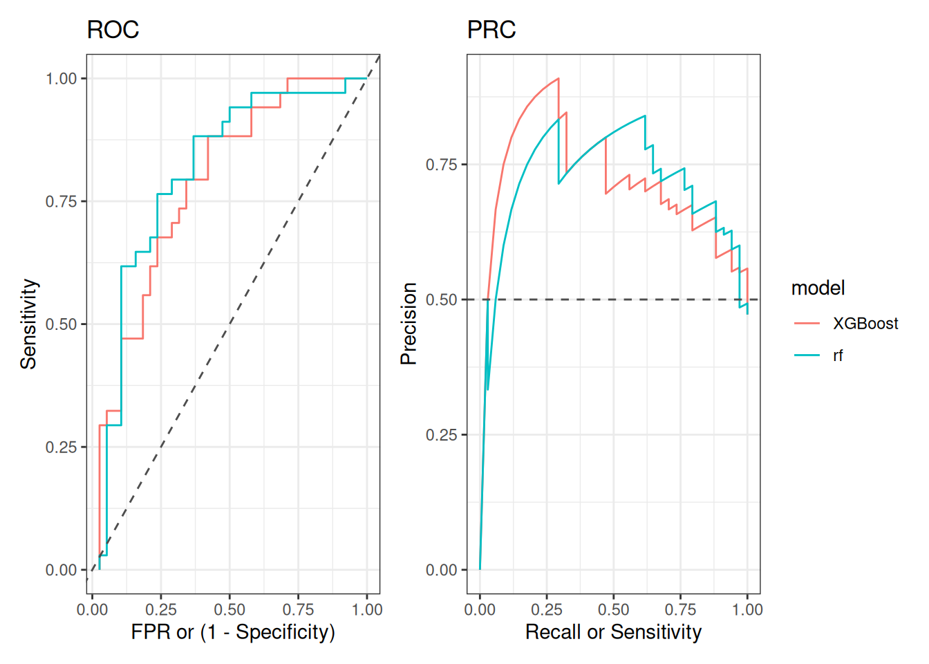
Before describing the plots and their meaning, it is worth noting that the ROC curves of both models resembles the curve presented in the article where this dataset was first analyzed (Qin et al. 2012) (see Figure 4B). Interestingly, authors used other supervised ML algorithm, and it was trained in a set of 50 microbiome genes (instead of taxonomic features and alpha diversity metrics, as we did). However, it is interesting that concordant AUCs and ROC curves shapes were obtained using different microbiome-derived information.
Regarding our figures, note the dashed gray lines in both plots representing the expected performance of a model that is classifying samples randomly. Therefore, the greater the distance between that reference and the line representing our model’s performance, the better. Thus, perfect performance will be achieve when the line is the farthest from that reference.
In our example, a model with perfect performance is such that, by learning patterns from the microbiome data, it can correctly identify T2D patients with perfect sensitivity (i.e., all T2D patients are classified as such) while maintaining a false positive rate (FPR) of 0 (i.e., no healthy individual is misclassified as T2D). In the ROC plot, this means the model consistently achieves a Sensitivity of 1 and a FPR of 0, pushing the curve towards the top left corner.
In terms of the PRC plot, the perfect model would consistently achieve a Recall and Precision of 1, pushing the curve towards the top right corner. That, in turn, would mean that the model has perfect Sensitivity (i.e., all T2D patients are classified as such), while maintaining a perfect Precision (i.e., every individual classified as T2D is actually a T2D patient).
Finally, note that the ROC curves of RF and XGBoost have a similar shape. This suggests a similar performance in classifying T2D patients. This isn’t surprising as the AUC of both models were very similar too (RF AUC = 0.6661 and XGBoost AUC = {r}# round(xgb[["performance"]][["AUC"]], 4)).
It was discussed above that ROC curves (and AUCs) can be extended to multiclass classification tasks. One example of such approach is this article (Su et al. 2022) where authors used gut microbiome data to train different classification supervised ML algorithms to discriminate between patients of 9 different diseases. Notice that the visualization of multiclass ROC curves can be achieved in a similar way to what was described in this chapter. In addition, the R package pROC provides handy functions to build multiclass visualizations.
21.6.2 Regression
In this chapter RF was used to learn patterns in the gut microbiome to predict the BMI of the participants. The most used diagnostic visualization of model’s performance is to compare observed against predicted BMI values.
The code below is used to generate that plot using the observations in the test data.
# Get the test set: data not used in training the model
test_data <- rf_regression[["test_data"]]

# Get the trained model
model <- rf_regression[["trained_model"]][["finalModel"]]

# Use the model to predict BMI values in the test set
pred <- predict(model, test_data)

# Add predicted BMI values to the test dataset
test_data$pred <- pred
# Add diagnosis status to test data.
# This variable was created when preprocessing for classification
ids <- rownames(test_data)
test_data$disease <- colData(tse)[ids, "disease"]

table(test_data$disease)
##
##      T2D healthy
##       36      32

# Plot actual (y-axis) vs predicted (x-axis) BMI values
obs_vs_pred <- ggplot(data = test_data) +
    geom_point(aes(x = pred, y = BMI, color = disease), size = 2)
# Add line showing perfect prediction
obs_vs_pred <- obs_vs_pred + geom_abline(color = "grey30", linetype = "dashed")
# Make axes of same scale
obs_vs_pred <- obs_vs_pred + coord_equal(xlim = c(17, 30), ylim = c(17, 30))
# Custom axes titles
obs_vs_pred <- obs_vs_pred + labs(x = "Predicted BMI", y = "Observed BMI")
# Add custom theme and visualize the plot
obs_vs_pred + theme_bw()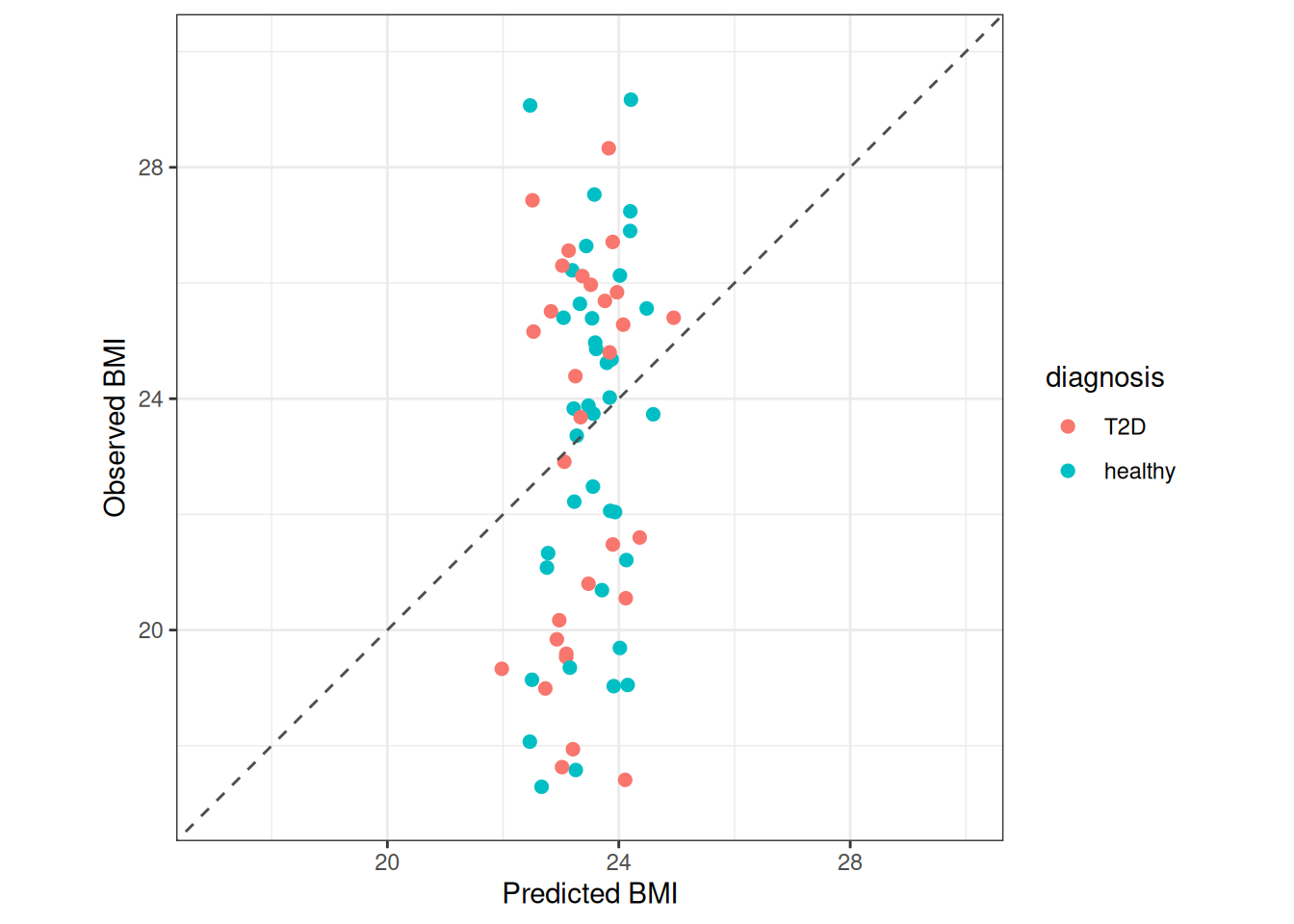
The dashed gray line in the plot above represents a perfect correlation between the observed and the model-predicted BMI values of each participant. Thus, the line indicates perfect performance of the model. We can see that while the predictions are around the mean BMI (close to 24), the observed values range approximately between 17 and 38, showing poor correlation between observed and predicted BMI values. Note that both groups show a similar spread in BMI.
This plot clearly indicates a poor performance of our model. This usually means that either the gut microbiome is not related to BMI, making it impossible for the model to use microbiome patterns to predict it, or that our model is overfitted. Since the RMSE for training (3.3819) and test (3.886) data are similar, we may conclude that gut microbiome composition is not informative of BMI.
This illustrate another important aspect of supervised ML. Regardless of the complexity of the models deployed, their predictive performance depends in their ability to learn meaningful patterns from the data. If such patterns don’t exist it would be impossible for the model to make accurate predictions. This is most likely what happened in this regression task. Notice that this can certainly happen in classification tasks too.
21.7 Model interpretation
Besides the performance of the model, researchers are often interested in understanding what are the features that are affecting the model’s performance, a property of ML models called interpretability.
ML models have different degrees of interpretability. One way to understand how different features (e.g., taxonomic identity) affect model’s performance is by randomly permuting the values of that feature across samples and then evaluating the amount of change in a performance metric.
For simplicity, the code below shows how to determine feature importance only with the RF model trained for classification. However, minimal changes are required to determine feature importance for other models built in this chapter, like the XGBoost model used in classification or the RF model used in regression.
# estimate features importance
feat_imp <- get_feature_importance(
    trained_model = rf_classification[["trained_model"]],
    test_data = rf_classification[["test_data"]],
    outcome_colname = "disease",
    perf_metric_function = multiClassSummary,
    perf_metric_name = "AUC",
    class_probs = TRUE,
    method = "rf",
    seed = 1,
    nperms = 5 # 1/20 of default to speed calculations up
)

# Identify the 10 most important features
ordered_features <- order(feat_imp$perf_metric_diff, decreasing = TRUE)
ordered_features <- ordered_features[1:10]

# Retain only those features
feat_imp <- feat_imp[ordered_features, ]

# Conver column 'feat' into a factor to fix its order in the plot
feat_imp$feat <- factor(feat_imp$feat, levels = rev(feat_imp$feat))

# Plot mean feature importance with 95% CI
ggplot(feat_imp) +
    geom_col(aes(x = perf_metric_diff, y = feat)) +
    labs(x = "Decrease in performance", y = "Feature") +
    theme_classic()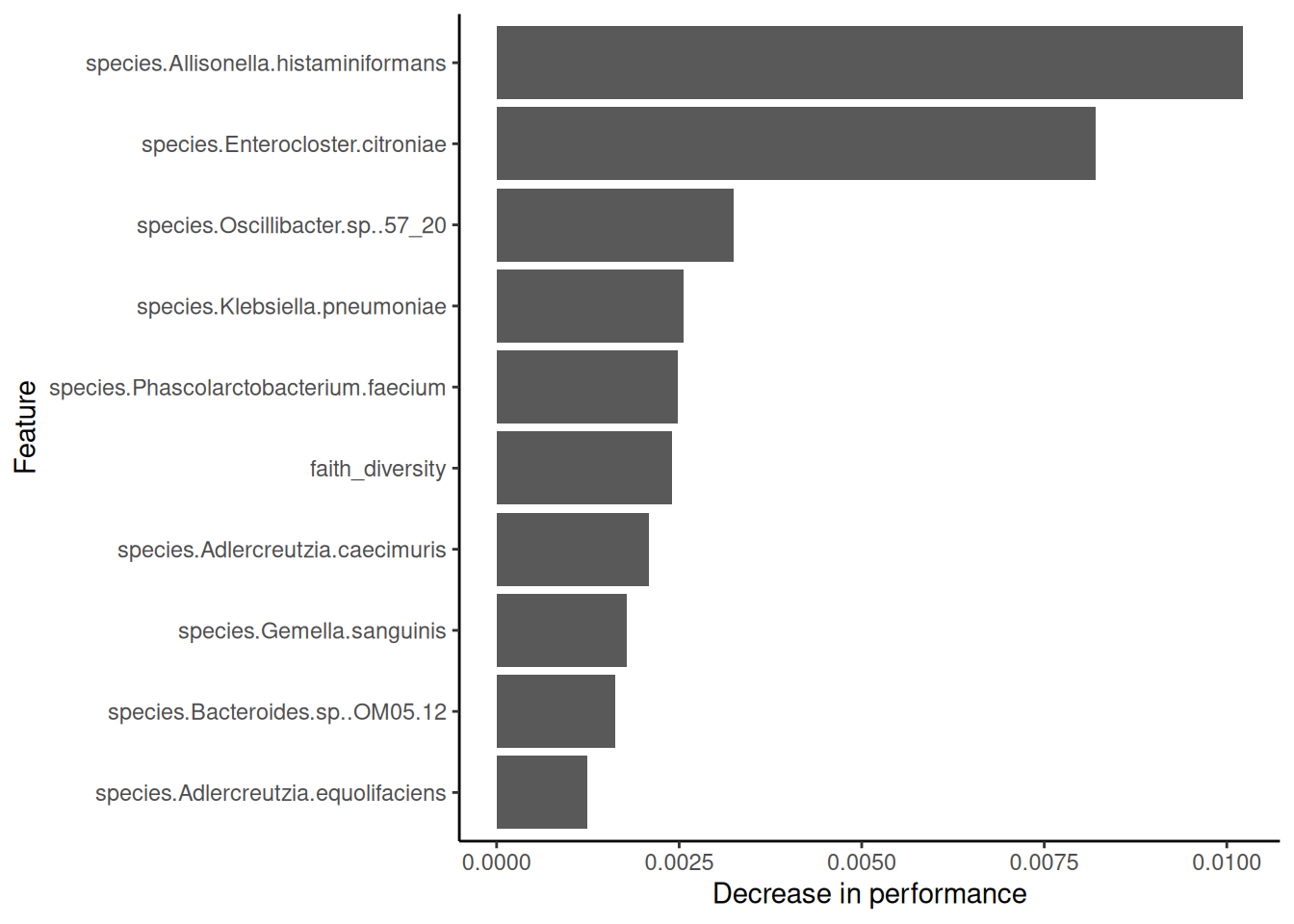
This plot shows the features with the highest effect on model’s performance. In other words, which features have most of the information required to differentiate between healthy participant and T2D patients. However, note that the differences in model performance are very close to zero, which indicates a small contribution of each taxonomic feature in allowing the model to distinguish between groups.
Interestingly, our results are coherent with what authors of the original analysis reported (Qin et al. 2012). For instance, they mention that F. prausnitzii and R. intestinalis (also within our most relevant features) are important nodes in the co-occurrence network enriched in healthy participants. On the other hand, they report several Clostridium representatives enriched in the T2D patients (see Figure 2A). This taxonomic feature was also reported as having the largest differences in the mean abundances between groups (Mei et al. 2024) (see Figures 2A and 2B).
Feature importance plots are often interpreted in the literature with a reductionist mindset. Thus, researchers often conclude that a single feature is responsible of a complex clinical output of interest. However, more often than not, microbes interact with one another, and thus the effect of a single taxonomic feature doesn’t always inform about ecosystem-level properties of the microbiome. It is important to bear that in mind when interpreting the results of our models.