15 Community similarity
Beta diversity quantifies the dissimilarity between communities (multiple samples), as opposed to alpha diversity, which focuses on variation within a community (one sample). In microbiome research, commonly used metrics of beta diversity include:
- Bray-Curtis index (for compositional data)
- Jaccard index (for presence/absence data, ignoring abundance information)
- Aitchison distance (Euclidean distance for clr transformed abundances, aiming to avoid the compositionality bias)
- Unifrac distance (takes into account the phylogenetic tree information).
Notably, only some of these measures are actual distances, as this is a mathematical concept whose definition is not satisfied by certain ecological measures, such as the Bray-Curtis index. Therefore, the terms dissimilarity and beta diversity are preferred.
| Method description | Assay type | Beta diversity metric |
|---|---|---|
| Quantitative profiling | Absolute counts | Bray-Curtis |
| Relative profiling | Relative abundances | Bray-Curtis |
| Aitchison distance | Absolute counts | Aitchison |
| Aitchison distance | clr | Euclidean |
| Robust Aitchison distance | rclr | Euclidean |
| Presence/Absence similarity | Relative abundances | Jaccard |
| Presence/Absence similarity | Absolute counts | Jaccard |
| Phylogenetic distance | Rarefied counts | Unifrac |
In practice, beta diversity is usually represented as a dist object. Such an object is a triangular matrix where the distance between each pair of samples is encoded by a specific cell. This distance matrix can then undergo ordination, which is an important ecological tool to reduce the dimensionality of data for a more efficient analysis and visualization. Ordination techniques aim to capture as much essential information from the data as possible and turn it into a lower dimensional representation. Dimension reduction is bound to lose information but commonly used ordination techniques can preserve relevant information of sample similarities in an optimal way, which is defined in different ways by different methods.
Based on the type of algorithm, ordination methods in microbiome research can be generally divided in two categories:
- unsupervised ordination
- supervised ordination
The former includes Principal Coordinate Analysis (PCoA), Principal Component Analysis (PCA) and Uniform Manifold Approximation and Projection for Dimension Reduction (UMAP), whereas the latter is mainly represented by distance-based Redundancy Analysis (dbRDA). First, we will discuss unsupervised ordination methods and then proceed to supervised ones.
Let us now prepare some demonstration data for the practical examples.
# Load mia and import sample dataset
library(mia)
data("GlobalPatterns", package = "mia")
tse <- GlobalPatterns

# Beta diversity metrics like Bray-Curtis are often
# applied to relabundances
tse <- transformAssay(
    tse, assay.type = "counts", method = "relabundance")

# Other metrics like Aitchison to clr-transformed data
tse <- transformAssay(
    tse, assay.type = "counts", method = "clr", pseudocount = TRUE)

# Add group information Feces yes/no
tse$Group <- tse$SampleType == "Feces"The standard Jaccard index is calculated based on a presence/absence table. However, a common mistake is using the quantitative version instead. By default, vegan::vegdist() computes the abundance-weighted Jaccard dissimilarity, which is similar to Bray-Curtis. This can be controlled using the binary parameter.
When calculating the Jaccard index with mia’s functions, it defaults to standard presence/absence version:
tse <- addDissimilarity(tse, assay.type = "counts", method = "jaccard")… or if you want to be more explicit, you can transform the data to presence/absence scale and then calculate the Jaccard index:
tse <- transformAssay(tse, method = "pa")
tse <- addDissimilarity(tse, assay.type = "pa", method = "jaccard")
15.1 Dissimilarity
Perhaps the simplest way to analyse dissimilarity is to calculate a dissimilarity matrix. In this matrix, each sample is compared against each other based on specified dissimilarity method. The result includes a single number for each sample-pair. This number tells how similar or dissimilar the microbial communities are.
One can calculate dissimilarity matrix with *Dissimilarity() functions. Here we use addDissimilarity() that adds the matrix to metadata slot. We calculate Unifrac dissimilarity that takes into account phylogenetic distances.
tse <- addDissimilarity(tse, assay.type = "counts" , method = "unifrac")The dissimilarities can then be visualized with a heatmap. Here we also add sample information to the plot.
library(ComplexHeatmap)

# Annotation for samples
annotation <- HeatmapAnnotation(sample_type = tse[["SampleType"]])

# Create a heatmap
Heatmap(
  metadata(tse)[["unifrac"]],
  heatmap_legend_param = list(title = "Unifrac"),
  bottom_annotation = annotation
)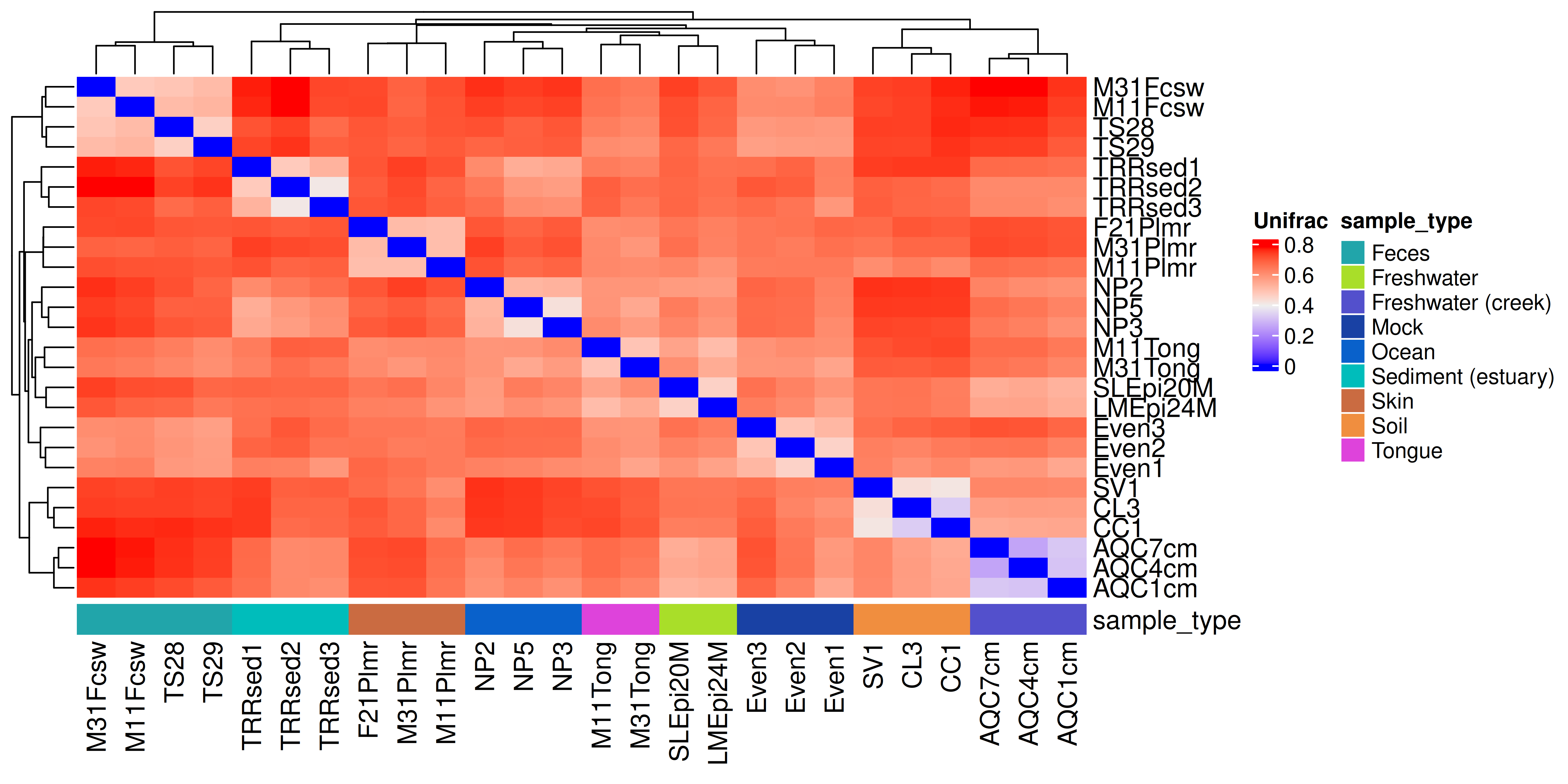
From the heatmap, we can observe that samples within the same sample type are the most similar to each other. The sample types follow the hierarchical clustering generated by the Heatmap() function.
The terms dissimilarity and distance are often used interchangeably, but they have distinct meanings.
All distance metrics are also dissimilarity metrics, but not all dissimilarity metrics are distance metrics.
Dissimilarity is a broader concept that measures how similar two samples are. Dissimilarity metrics do not necessarily fulfill the requirements of distances. For instance, Bray-Curtis is a dissimilarity metric.
Distance metrics, for example Euclidean distance, measure how far apart two samples are. The distance between two points is always symmetric meaning that it distance from A to B equals distance from B to A. Moreover, the straight line between two points is always the shortest possible distance.
15.2 Divergence
Divergence measure refers to a difference in community composition between the given sample(s) and a reference sample. This can be evaluated with addDivergence(). Reference and algorithm for the calculation of divergence can be specified as reference and FUN, respectively.
tse <- addDivergence(
    tse,
    assay.type = "counts",
    reference = "median",
    FUN = getDissimilarity)
15.3 Permutational Multivariate Analysis of Variance
PERMANOVA (Permutational Multivariate Analysis of Variance) can be seen as a non-parametric, multivariate extension of ANOVA (Analysis of Variance). It is used to compare groups in multivariate data and to assess whether a variable explains differences in the data. PERMANOVA first calculates the dissimilarities between samples, then compares the centroids (multivariate means) of each group to determine if they differ significantly.
PERMANOVA determines statistical significance by permuting (randomly shuffling) group labels many times. By comparing the observed test statistic to those from the permutations, it assesses if the observed group differences are likely due to chance, without relying on parametric assumptions.
Since PERMANOVA relies on comparing centroids, it assumes that the variation within groups is smaller than the variation between groups, meaning the groups are distinct. If this assumption isn’t met, it can affect the interpretation of the results, so it’s important to check this assumption before drawing conclusions.
res <- getPERMANOVA(
    tse,
    assay.type = "relabundance",
    formula = x ~ SampleType
    )
res
##  $permanova
##  Permutation test for adonis under reduced model
##  Marginal effects of terms
##  Permutation: free
##  Number of permutations: 999
##
##  adonis2(formula = formula, data = data, method = ..1, by = by, na.action = na.action)
##             Df SumOfSqs    R2    F Pr(>F)
##  SampleType  8     8.25 0.731 5.78  0.001 ***
##  Residual   17     3.03 0.269
##  Total      25    11.28 1.000
##  ---
##  Signif. codes:  0 '***' 0.001 '**' 0.01 '*' 0.05 '.' 0.1 ' ' 1
##
##  $homogeneity
##             Df Sum Sq Mean Sq     F N.Perm Pr(>F) Total variance
##  SampleType  8 0.4997 0.06246 5.807    999  0.005         0.6825
##             Explained variance
##  SampleType             0.7321
The output includes both PERMANOVA and homogeneity results. When PERMANOVA results are significant, we check the homogeneity results to ensure reliability. The homogeneity test measures group dispersions which are the the average distances between samples and their group centroids. A non-significant homogeneity result indicates that groups have similar within-group variability, i.e., the group dispersions are homogenous, which is desired in PERMANOVA.
In our case, PERMANOVA results are significant; however, the homogeneity test shows a significant difference in group dispersion. This suggests that the observed differences may be influenced by unequal variability among groups, and therefore, caution is needed when interpreting the PERMANOVA result. The effect of SampleType on microbial composition may be confounded by dispersion differences.
PERMANOVA and distance-based redundancy analysis (dbRDA) are closely related, and often they give similar results. However, their assumptions are different; while PERMANOVA is non-parametric method, dbRDA assumes linear relationships in dissimilarity matrix. However, dbRDA can be used more broadly as the ordination can also be visualized.
15.4 Unsupervised ordination
Unsupervised ordination methods analyze variation in the data without additional information on covariates or other supervision of the model. Among the different approaches, Multi-Dimensional Scaling (MDS) and non-metric MDS (NMDS) can be regarded as the standard. They are jointly referred to as PCoA. For this demonstration, we will analyse beta diversity in GlobalPatterns, and observe the variation between stool samples and those with a different origin.
15.4.1 Comparing communities by beta diversity analysis
A typical comparison of community compositions starts with a visual representation of the groups by a 2D ordination. Then we estimate relative abundances and MDS ordination based on Bray-Curtis index between the groups, and visualize the results.
In the following examples dissimilarity is calculated with the function supplied to the FUN argument. Several metrics of beta diversity are defined by the vegdist() function of the vegan package, which is often used in this context. However, such custom functions created by the user also work, as long as they return a dist object. In either case, this function is then applied to calculate reduced dimensions via an ordination method, the results of which can be stored in the reducedDim slot of the TreeSE. This entire process is contained by the addMDS() and addNMDS() functions.
Sample dissimilarity can be visualized on a lower-dimensional display (typically 2D) using the plotReducedDim() function from the scater package. This also provides tools to incorporate additional information encoded by color, shape, size and other aesthetics. Can you find any difference between the groups?
# Create ggplot object
p <- plotReducedDim(tse, "MDS_bray", colour_by = "Group")

# Calculate explained variance
e <- attr(reducedDim(tse, "MDS_bray"), "eig")
rel_eig <- e / sum(e[e > 0])

# Add explained variance for each axis
p <- p + labs(
    x = paste("PCoA 1 (", round(100 * rel_eig[[1]], 1), "%", ")", sep = ""),
    y = paste("PCoA 2 (", round(100 * rel_eig[[2]], 1), "%", ")", sep = "")
    )

p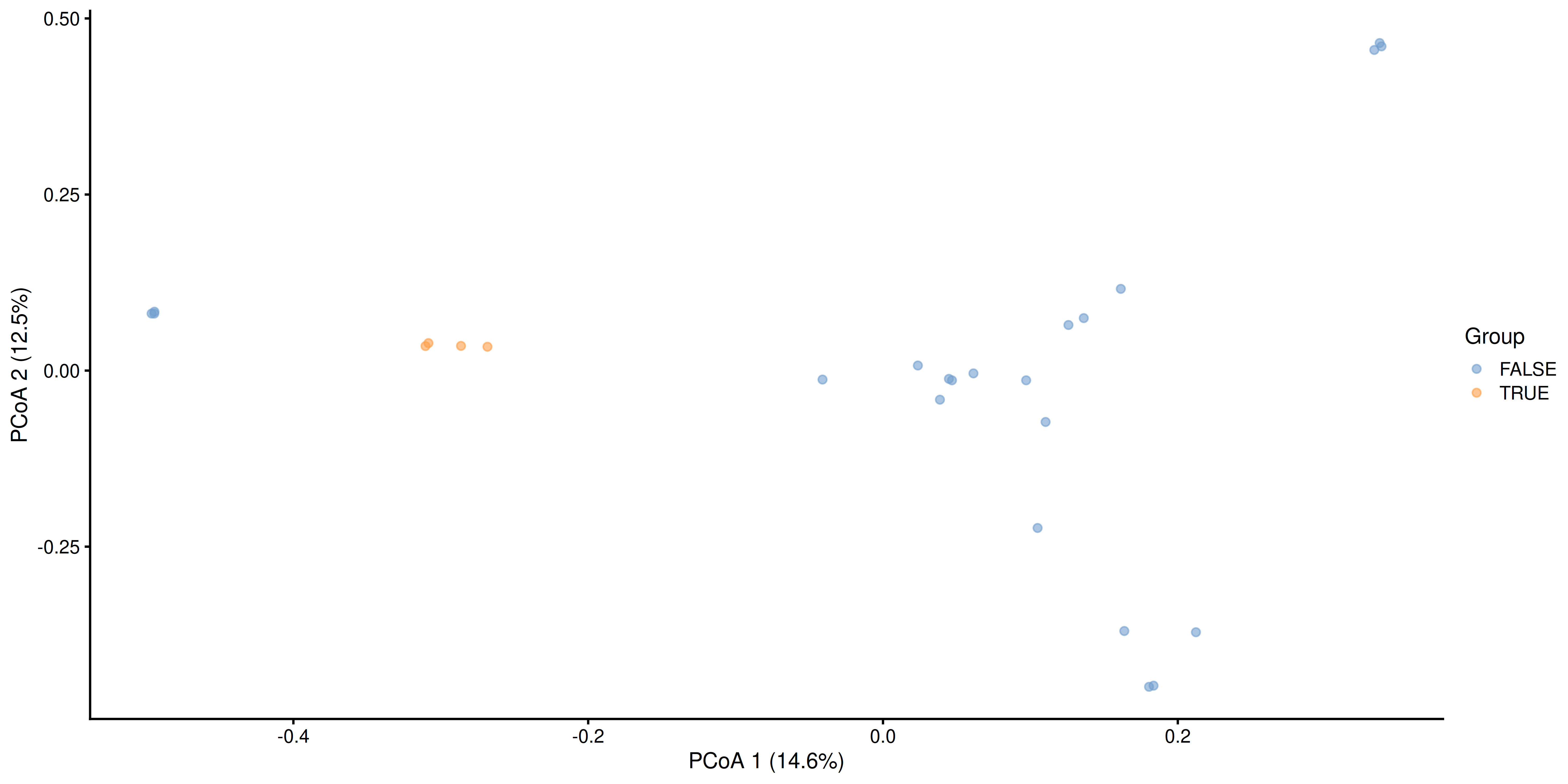
To further visualize the differences between the groups, we can add boxplots that display the distribution of the scores with respect to each group.
library(ggExtra)

p <- ggMarginal(p, type = "boxplot", groupFill = TRUE)
p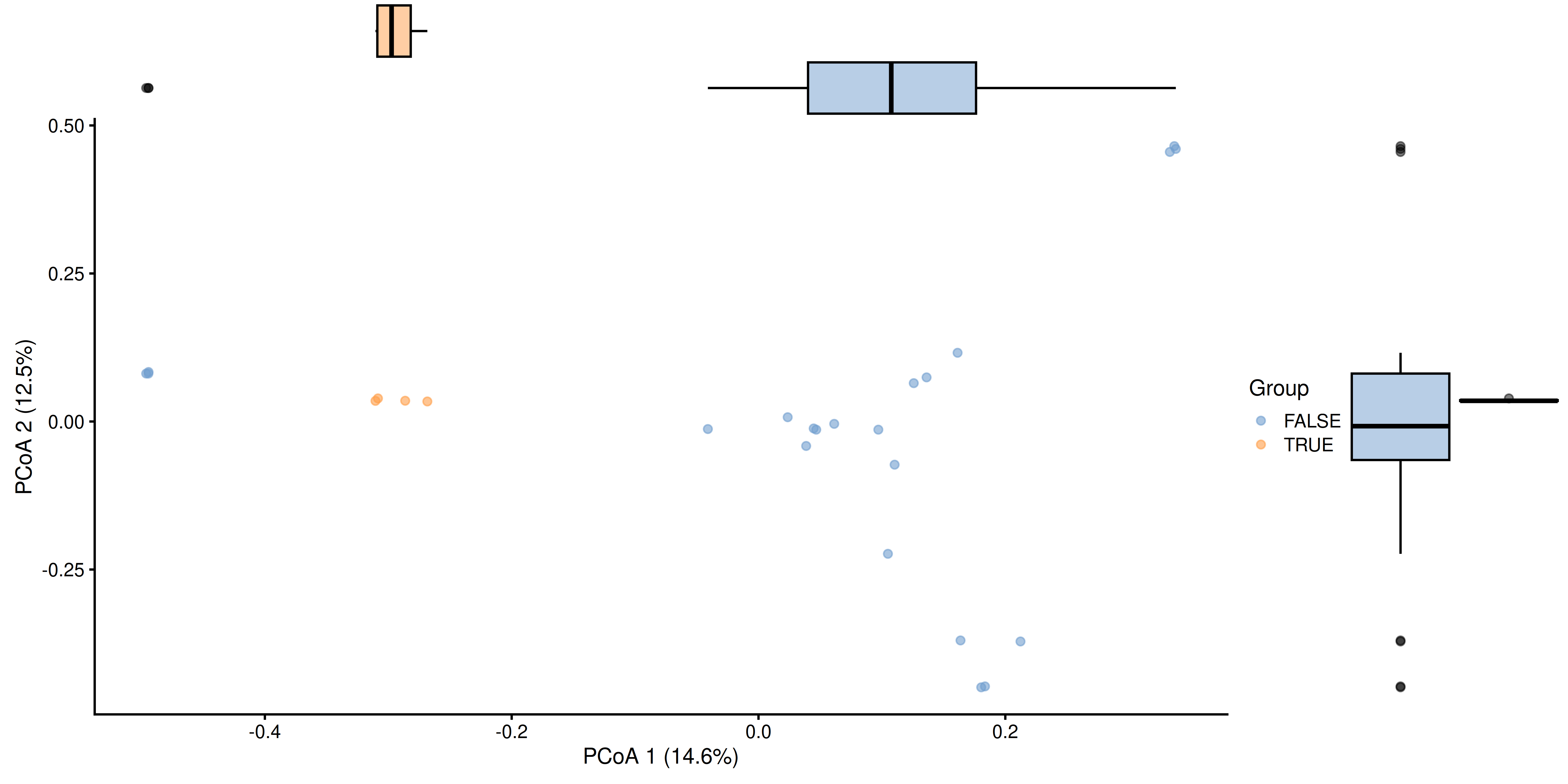
A few combinations of beta diversity metrics and assay types are typically used. For instance, Bray-Curtis dissimilarity and Euclidean distance are often applied to the relative abundance and the clr assays, respectively. Besides beta diversity metric and assay type, the PCoA algorithm is also a variable that should be considered. Below, we show how the choice of these three factors can affect the resulting lower-dimensional data.
# Run NMDS on relabundance assay with Bray-Curtis distances
tse <- addNMDS(
    tse,
    FUN = getDissimilarity,
    method = "bray",
    assay.type = "relabundance",
    name = "NMDS_bray")

# Run MDS on clr assay with Aitchison distances
tse <- addMDS(
    tse,
    FUN = getDissimilarity,
    method = "euclidean",
    assay.type = "clr",
    name = "MDS_aitchison")

# Run NMDS on clr assay with Euclidean distances
tse <- addNMDS(
    tse,
    FUN = getDissimilarity,
    method = "euclidean",
    assay.type = "clr",
    name = "NMDS_aitchison")
Multiple ordination plots are combined into a multi-panel plot with the patchwork package, so that different methods can be compared to find similarities between them or select the most suitable one to visualize beta diversity in the light of the research question.
# Load package for multi-panel plotting
library(patchwork)

# Generate plots for all 4 reducedDims
plots <- lapply(
    c("MDS_bray", "MDS_aitchison", "NMDS_bray", "NMDS_aitchison"),
    plotReducedDim,
    object = tse,
    colour_by = "Group")

# Generate multi-panel plot
wrap_plots(plots) +
    plot_layout(guides = "collect")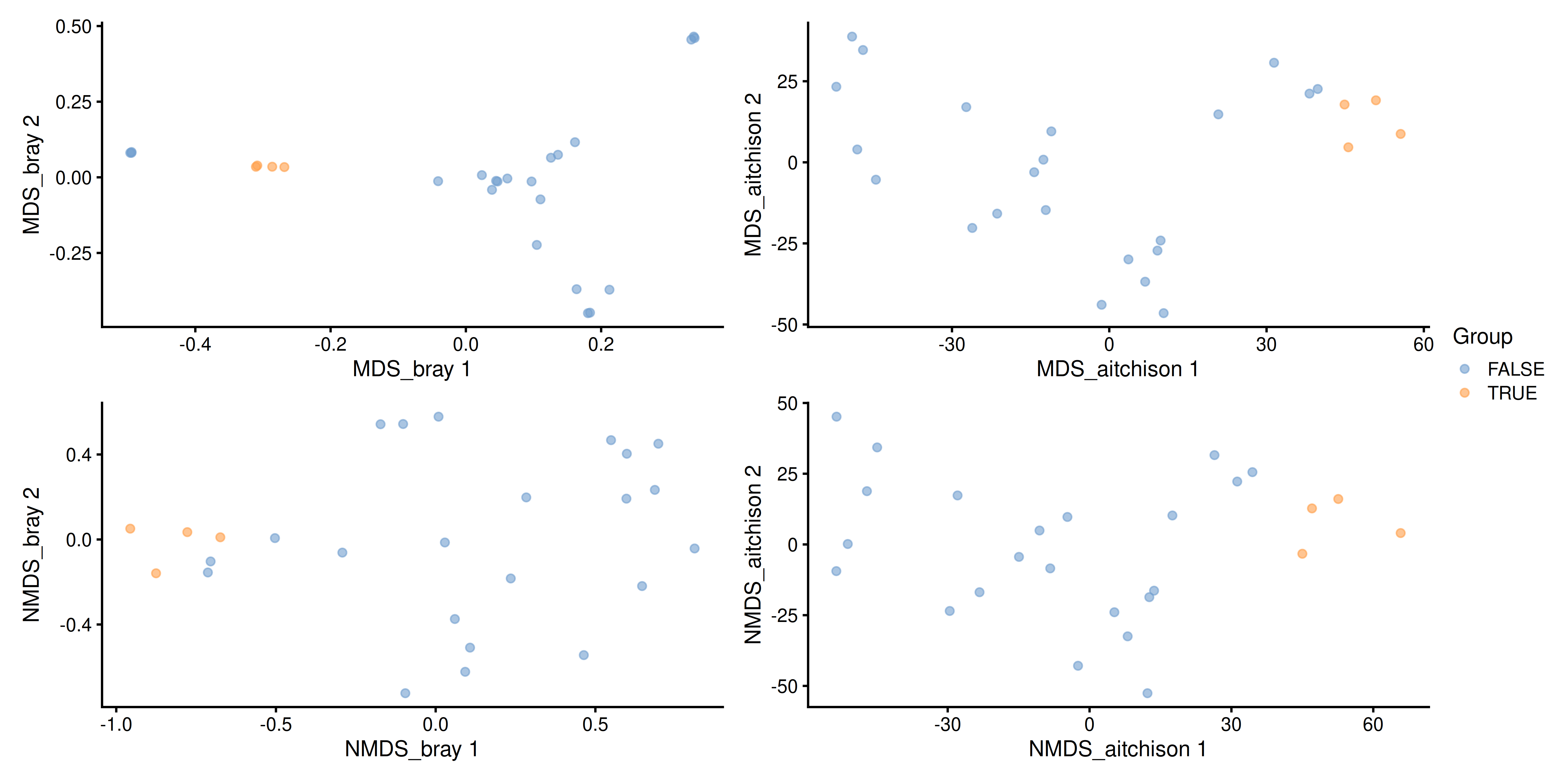
The Unifrac method is a special case, as it requires data on the relationship of features in the form of a phylo tree. getDissimilarity() performs the calculation to return a dist object, which can again be used within addMDS().
tse <- addMDS(
    tse,
    FUN = getDissimilarity,
    method = "unifrac",
    name = "unifrac",
    tree = rowTree(tse),
    ntop = nrow(tse),
    assay.type = "counts")

plotReducedDim(tse, "unifrac", colour_by = "Group")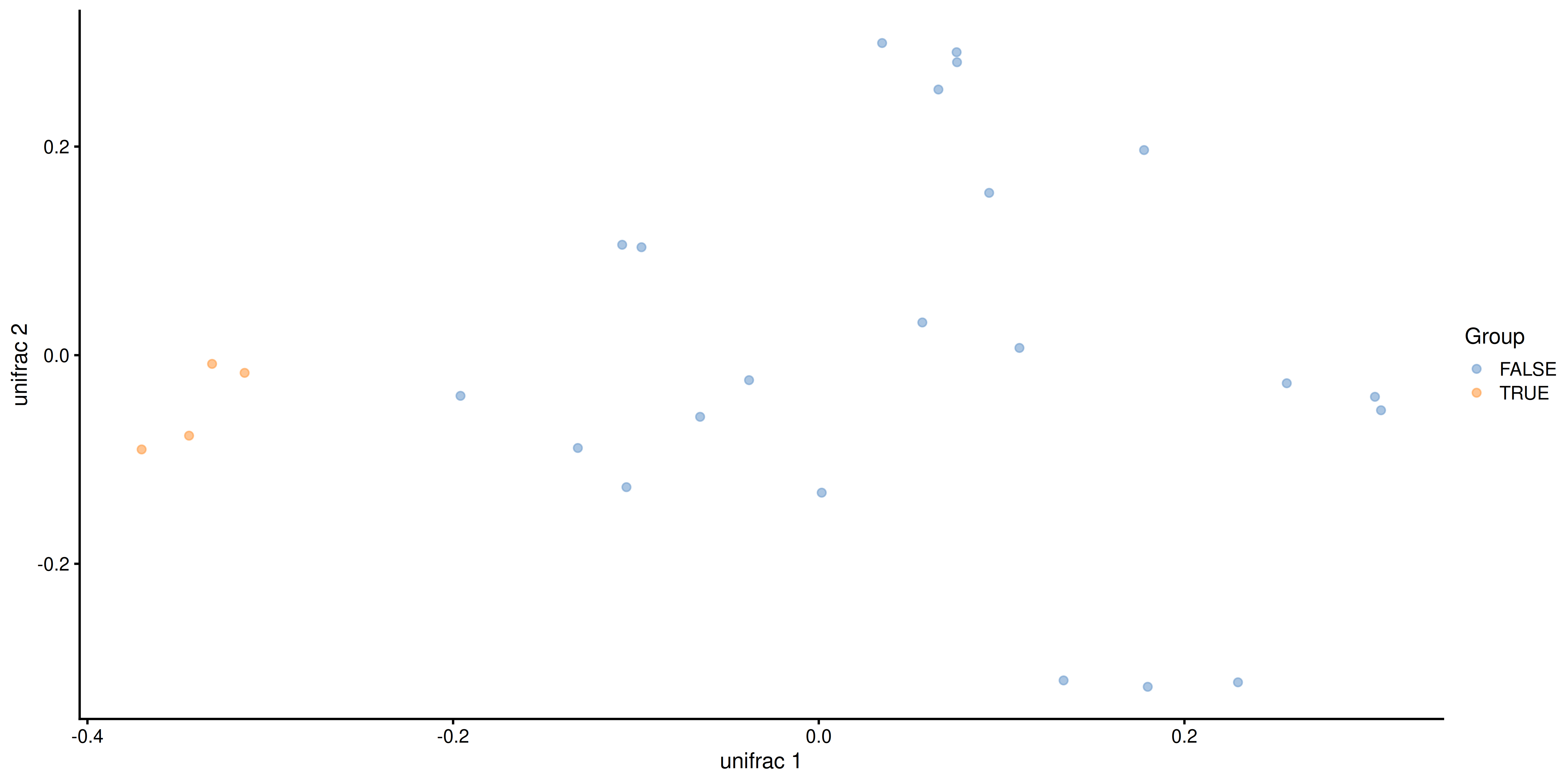
15.4.2 Rarefaction to mitigate impacts of uneven sequencing effort
The sequencing depth of a sample refers to the number of metagenomic reads obtained from the sequencing process. A variation in sequencing depth across the samples of a study may impact the calculation of alpha and beta diversity metrics (Patrick D. Schloss 2023). It is common to find significant variation in sequencing depth between samples. For instance, the samples of the TreeSummarizedExperiment dataset GlobalPatterns show up to a 40-fold difference in the number of metagenomic reads.
To address uneven sequencing effort, rarefaction aims to normalize metagenomic reads counts using subsampling. First, the user chooses the rarefaction depth and a number of iterations N. All the samples with metagenomic reads count below the rarefaction depth are removed and metagenomic reads are randomly drawn from the samples left to get subsamples fitting the rarefaction depth. Then a beta diversity metric is calculated from those subsamples and the process is iterated N times. Finally, beta diversity is estimated with the mean of all beta diversity values calculated on subsampled data.
There has been a long-lasting controversy surrounding the use of rarefaction in microbial ecology. The main concern is that rarefaction would omit data (McMurdie and Holmes 2014) (Patrick D. Schloss 2024). However, if the subsampling process is repeated a sufficient number of times, and if the rarefaction depth is set to the lowest metagenomic reads count found across all samples, no data will be omitted. Moreover, Patrick Schloss has demonstrated that rarefaction is “the only method that could control for variation in uneven sequencing effort when measuring commonly used alpha and beta diversity metrics” (Patrick D. Schloss 2023).
Let us first convert the count assay to centered log ratio (clr) assay and calculate MDS with Aitchison distance without rarefaction:
# Centered log-ratio transformation to properly apply Aitchison distance

tse <- transformAssay(
    tse,
    assay.type = "counts",
    method = "clr",
    pseudocount = 1
    )

# Run MDS on clr assay with Aitchison distance
tse <- addMDS(
    tse,
    FUN = getDissimilarity,
    method = "euclidean",
    assay.type = "clr",
    name = "MDS_aitchison"
    )
Then let’s do the same with rarefaction:
# Define custom transformation function..
clr <- function (x) {
    vegan::decostand(x, method = "clr", pseudocount = 1)
}

# Run transformation after rarefactions before calculating the beta diversity
tse <- addMDS(
    tse,
    assay.type = "counts",
    FUN = getDissimilarity,
    method = "euclidean",
    niter = 10, # Number of iterations
    sample = min(colSums(assay(tse, "counts"))), # Rarefaction depth
    transf = clr, # Applied transformation
    replace = TRUE,
    name = "MDS_aitchison_rarefied"
    )
Now we are ready for plot non-rarefied and rarefied MDS plots side-by-side.
# Generate plots for non-rarefied and rarefied Bray-Curtis distances scaled by
# MDS
plots <- lapply(
    c("MDS_aitchison", "MDS_aitchison_rarefied"),
    plotReducedDim,
    object = tse,
    colour_by = "SampleType"
    )

# Generate multi-panel plot
wrap_plots(plots) +
    plot_layout(guides = "collect")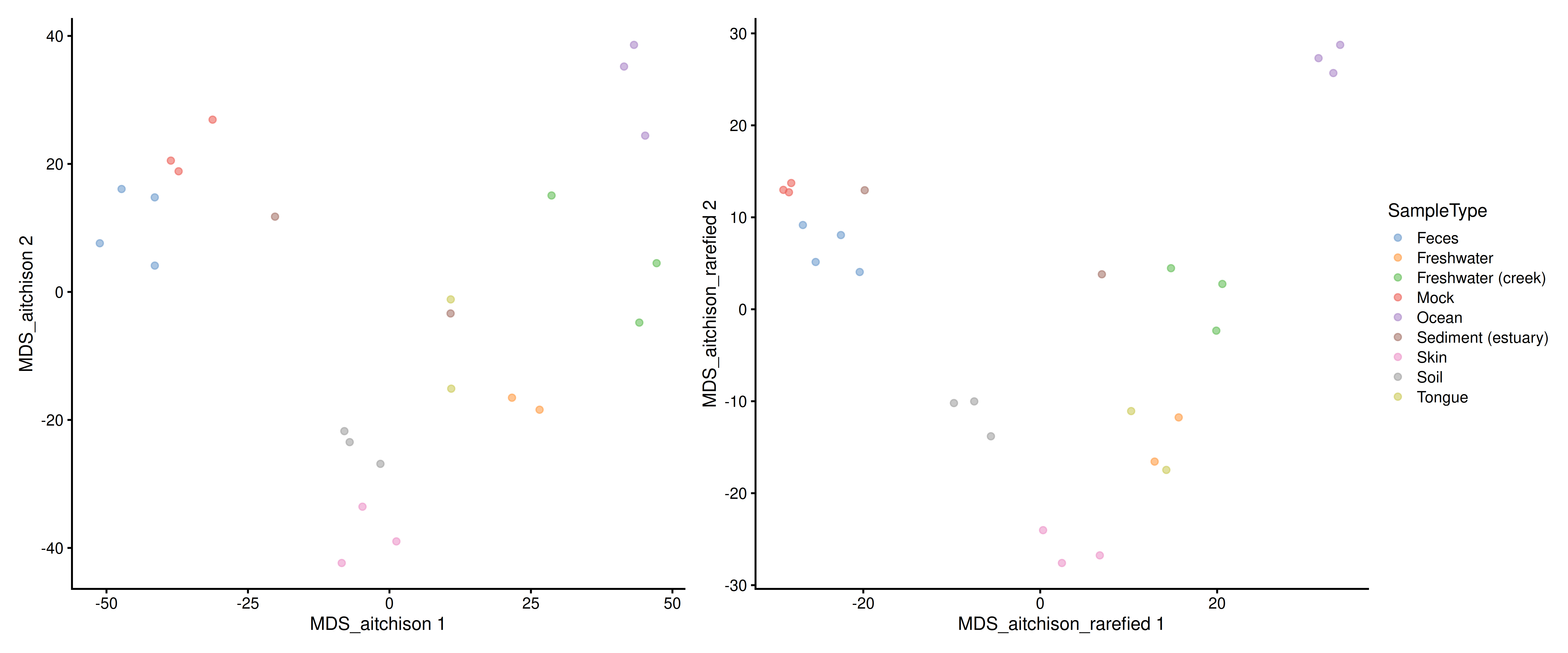
ntop is a addMDS() option. Here it is set to total number of features in GlobalPatterns dataset so that they are not filtered. If ntop was not set to the total number of features, only the ntop features with highest variance would be used for dimensionality reduction and the other features would be filtered.
When rarefaction is not done, the getDissimilarity() utilizes vegan::vegdist() function while in rafection vegan::avgdist() is applied. The argument sample is set to the smallest metagenomic reads count across all samples. This ensures that no sample will be removed during the rarefaction process.
The argument niter is by default set to 100 but 10 iterations is often sufficient for beta diversity calculations.
To use transformations after the rarefaction of the samples and before the beta diversity calculation, we can use the argument transf.
We can also plot the correlation between principal coordinates PCx and PCy for both the rarefied and non-rarefied distance calculations:
library(ggpubr)

p <- lapply(1:2, function(i){
    # Principal axes are sign invariant;
    # align the signs; if the correlation is negative then swap the other axis
    original <- reducedDim(tse, "MDS_aitchison")[, i]
    rarefied <- reducedDim(tse, "MDS_aitchison_rarefied")[, i]

    temp  <- ggplot(
        data = data.frame(original, rarefied),
        aes(x = original, y = rarefied)
        ) +
        geom_point() + geom_smooth(method = "lm") +
        stat_cor(method = "pearson") +
        labs(title = paste0("Principal coordinate ", i))
    return(temp)
})
wrap_plots(p)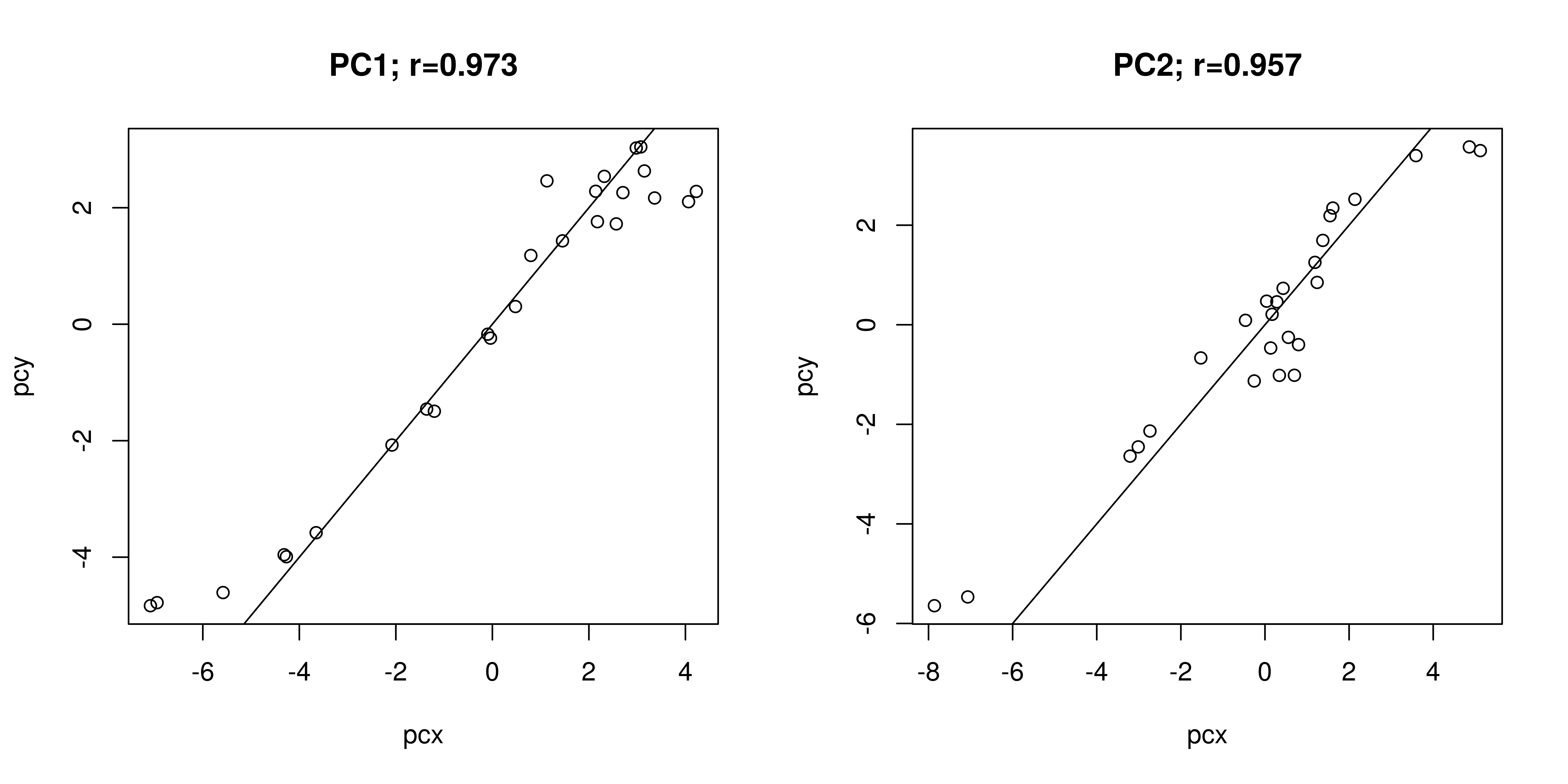
The mia package’s addAlpha() and getDissimilarity() functions support rarefaction in alpha and beta diversity calculations. Additionally, the rarefyAssay() function allows random subsampling of a given assay within a TreeSummarizedExperiment dataset.
15.4.3 Other ordination methods
Other dimension reduction methods, such as PCA and UMAP, are inherited from the scater package.
tse <- runPCA(
    tse,
    name = "PCA",
    assay.type = "counts",
    ncomponents = 10)

plotReducedDim(tse, "PCA", colour_by = "Group")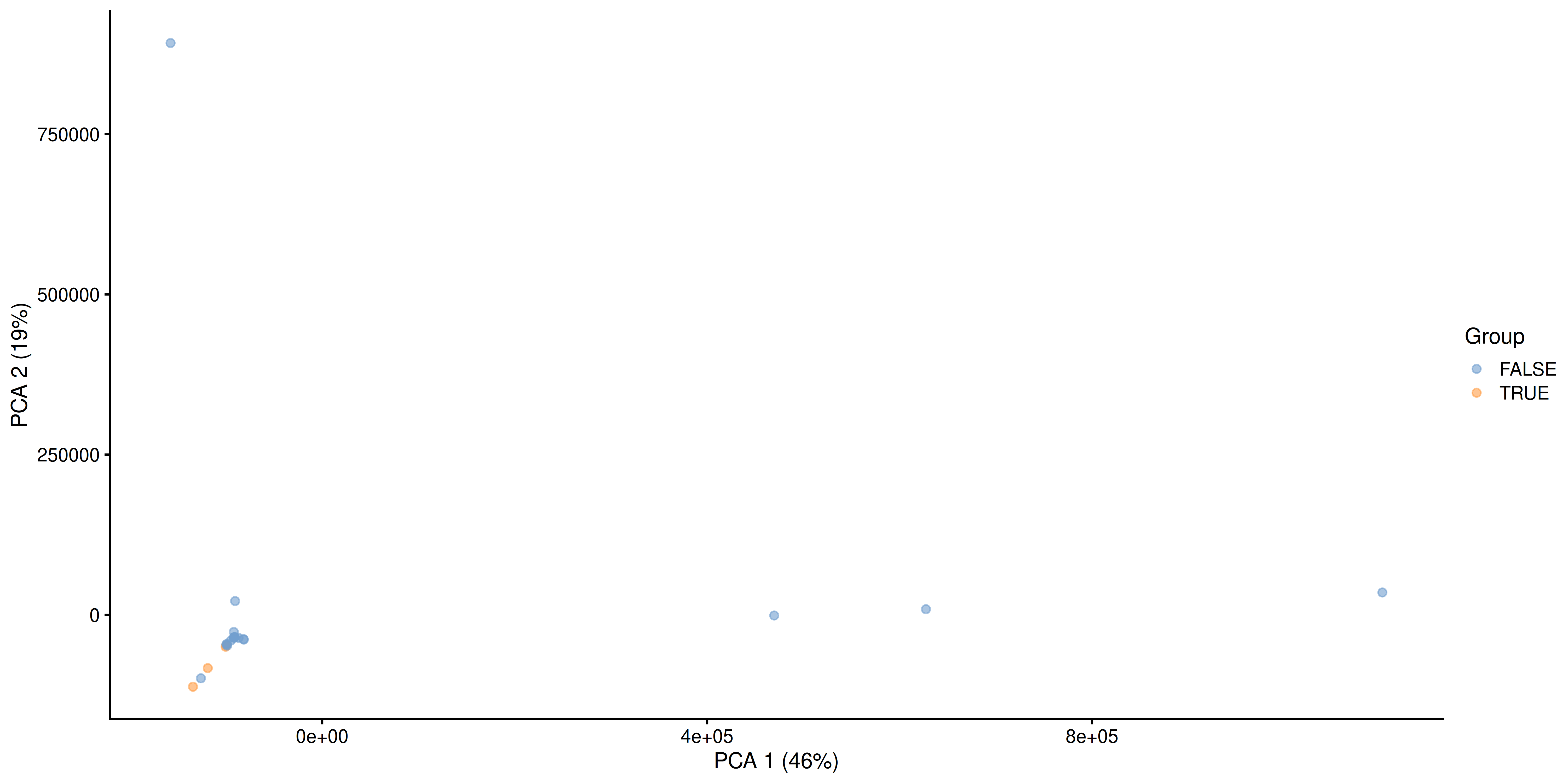
As mentioned before, applicability of the different methods depends on your sample set and research question.
tse <- runUMAP(
    tse,
    name = "UMAP",
    assay.type = "counts",
    ncomponents = 3)

plotReducedDim(tse, "UMAP", colour_by = "Group", ncomponents = c(1:3))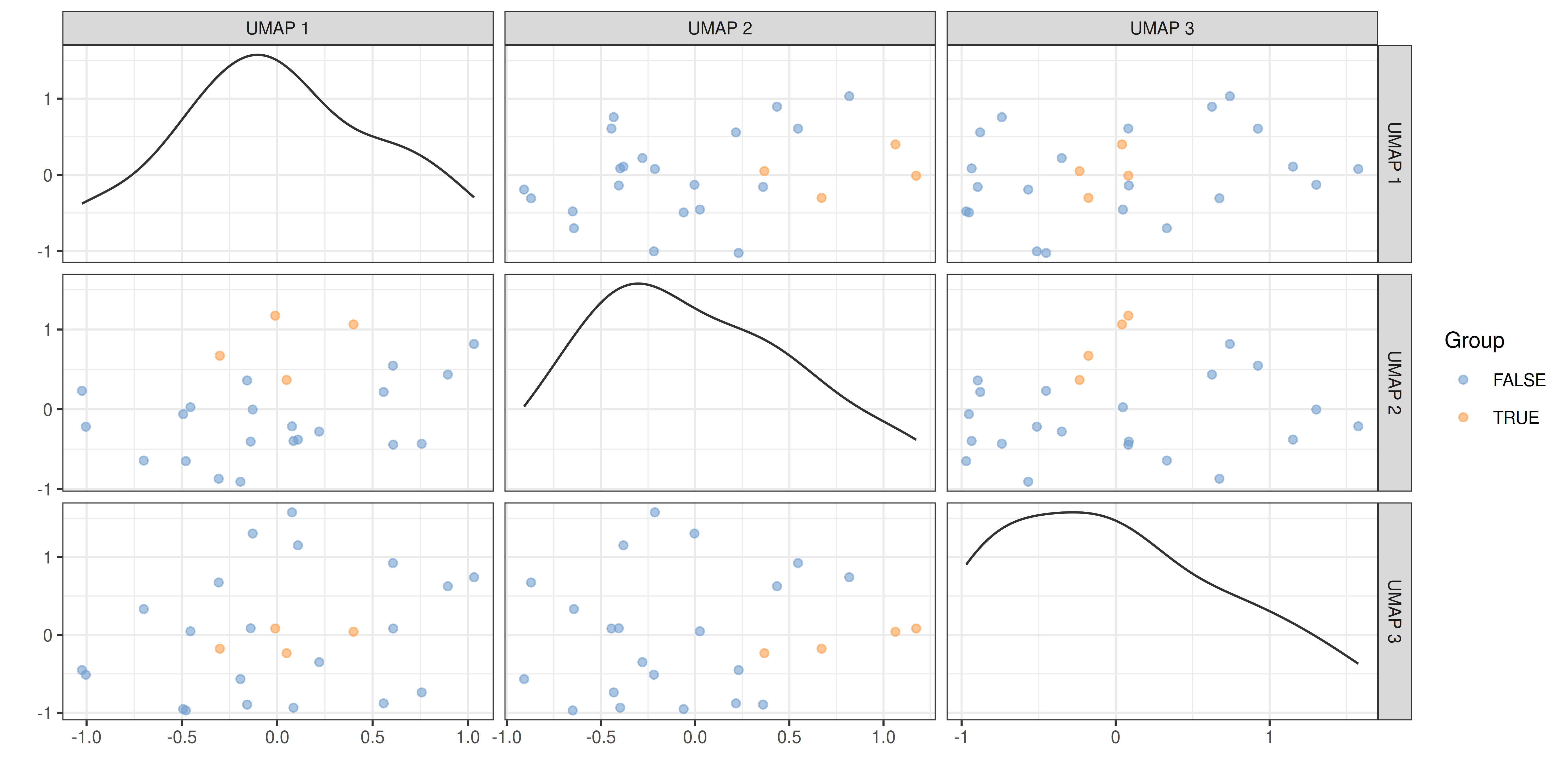
15.4.4 Explained variance
The percentage of explained variance is typically shown in PCA ordination plots. This quantifies the proportion of overall variance in the data that is captured by the PCA axes, or how well the ordination axes reflect the original distances.
Sometimes a similar measure is shown for MDS/PCoA. The interpretation is generally different, however, and hence we do not recommend using it. PCA is a special case of PCoA with Euclidean distances. With non-Euclidean dissimilarities PCoA uses a trick where the pointwise dissimilarities are first cast into similarities in a Euclidean space (with some information loss i.e. stress) and then projected to the maximal variance axes. In this case, the maximal variance axes do not directly reflect the correspondence of the projected distances and original distances, as they do for PCA.
In typical use cases, we would like to know how well the ordination reflects the original similarity structures; then the quantity of interest is the so-called “stress” function, which measures the difference in pairwise similarities between the data points in the original (high-dimensional) vs. projected (low-dimensional) space.
Hence, we propose that for PCoA and other ordination methods, users would report relative stress, which varies within the unit interval and is better if smaller. This can be calculated as shown below.
# Quantify dissimilarities in the original feature space
d0 <- as.matrix(getDissimilarity(t(assay(tse, "relabundance")), "bray"))

# PCoA Ordination
tse <- addMDS(
  tse,
  FUN = getDissimilarity,
  name = "PCoA",
  method = "bray",
  assay.type = "relabundance")

# Quantify dissimilarities in the ordination space
dp <- as.matrix(dist(reducedDim(tse, "PCoA")))

# Calculate stress i.e. relative difference
# in the original and projected dissimilarities
stress <- sum((dp - d0)^2) / sum(d0^2)
A Shepard plot visualizes the original versus the ordinated dissimilarity between the observations.
ord <- order(as.vector(d0))
df <- data.frame(d0 = as.vector(d0)[ord],
                 dmds = as.vector(dp)[ord])

ggplot(df, aes(x = d0, y = dmds)) +
  geom_smooth() +
  geom_point() +
  labs(title = "Shepard plot",
       x = "Original distance",
       y = "MDS distance",
       subtitle = paste("Stress:", round(stress, 2))) +
  theme_bw()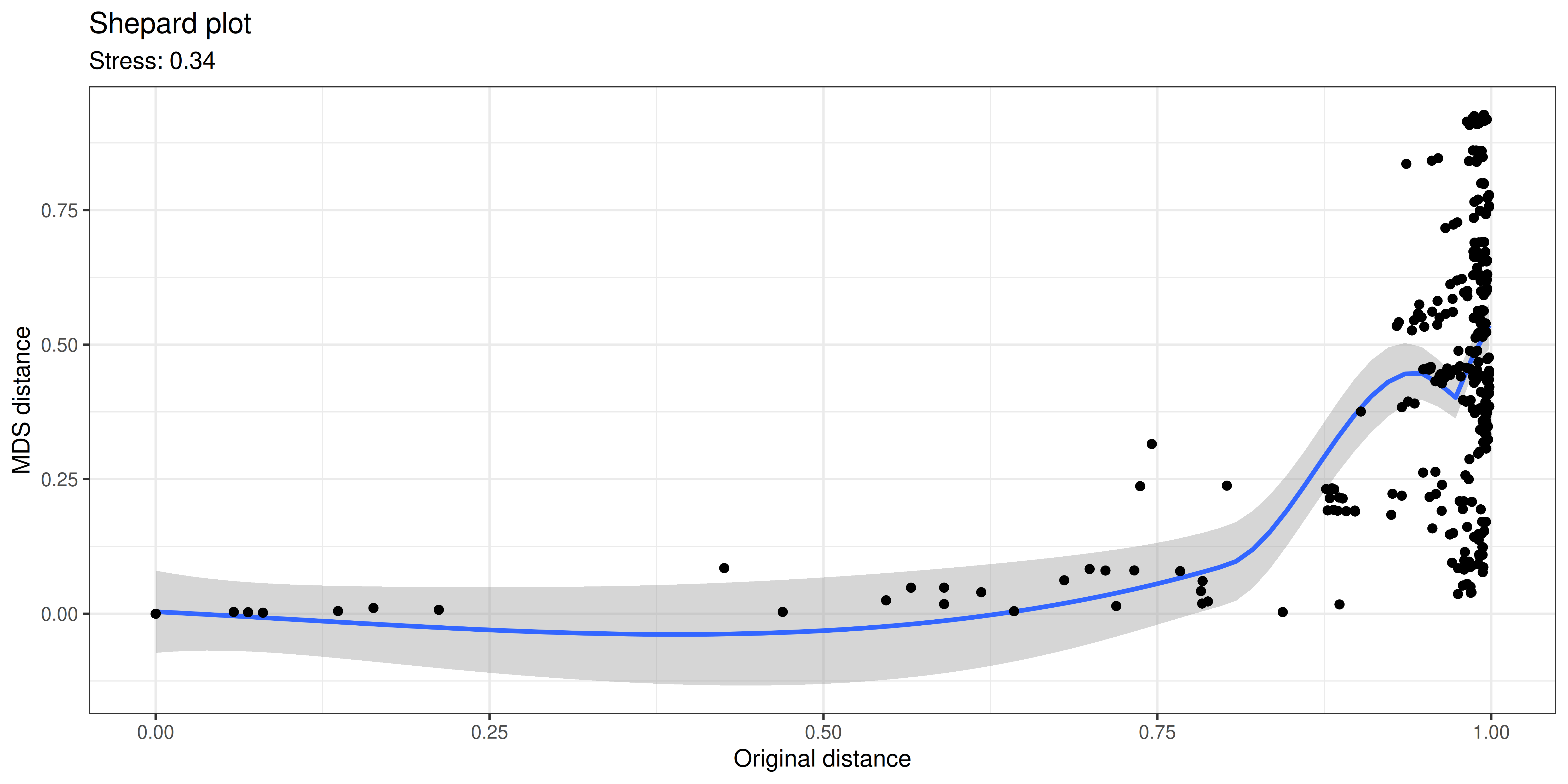
15.5 Supervised / constrained ordination
dbRDA is a supervised counterpart of PCoA. It maximize the variance with respect to the covariates provided by the user. This can be used to quantify associations between each covariate and community composition (beta diversity). The table below summarizes the relations between the supervised and unsupervised ordination methods.
| supervised ordination | unsupervised ordination | |
|---|---|---|
| Euclidean distance | RDA | PCA |
| non-Euclidean distance | dbRDA | PCoA/MDS, NMDS, UMAP |
In summary, the “dbRDA” is the more general method that allows a wider variety dissimilarity, or beta diversity, indices. This method is available via mia::getRDA(), which calls vegan::dbrda(). By default, this uses Euclidean distances, which is equivalent to the ordinary RDA. However, the dbRDA method (mia::getRDA()) allows the use of other dissimilarity indices as well.
Let us next demonstrate dbRDA with the enterotype dataset. Here samples correspond to patients. The colData lists the clinical status of each patient and a few covariates such as gender and age.
# Load data
data("enterotype", package = "mia")
tse2 <- enterotype

# Apply relative transform
tse2 <- transformAssay(tse2, method = "relabundance")
15.5.1 Redundancy analysis
dbRDA can be perfomed with the addRDA() function. In addition to the arguments previously defined for unsupervised ordination, this function takes a formula to control for variables and an action to treat missing values. Along with clinical status, which is the main outcome, we control for gender and age, and exclude observations where one of these variables is missing.
# Perform RDA
tse2 <- addRDA(
    tse2,
    assay.type = "relabundance",
    formula = assay ~ ClinicalStatus + Gender + Age,
    distance = "bray",
    na.action = na.exclude)

# Store results of PERMANOVA test
rda_info <- attr(reducedDim(tse2, "RDA"), "significance")
The importance of each variable on the similarity between samples (i.e. loadings) can be assessed from the results of PERMANOVA, automatically provided by the addRDA() function. It performs first dbRDA and then applies permutational test to its results.
Permutational Analysis of Variance (PERMANOVA; (2001)) is a widely used non-parametric multivariate method that aims to estimate the actual statistical significance of differences in the observed community composition between two groups of samples.
PERMANOVA tests the hypothesis that the centroids and dispersion of the community are equivalent between the compared groups. A p-value smaller than the significance threshold indicates that the groups have a different community composition. This method is implemented with the adonis2 function from the vegan package. You can find more on PERMANOVA from here.
We see that both clinical status and age explain more than 10% of the variance, but only age has statistical significance.
rda_info$permanova |>
knitr::kable()| Df | SumOfSqs | F | Pr(>F) | Total variance | Explained variance | |
|---|---|---|---|---|---|---|
| Model | 6 | 1.1157 | 1.940 | 0.028 | 3.991 | 0.2795 |
| ClinicalStatus | 4 | 0.5837 | 1.522 | 0.141 | 3.991 | 0.1463 |
| Gender | 1 | 0.1679 | 1.751 | 0.112 | 3.991 | 0.0421 |
| Age | 1 | 0.5245 | 5.471 | 0.001 | 3.991 | 0.1314 |
| Residual | 30 | 2.8757 | NA | NA | 3.991 | 0.7205 |
Next, we proceed to visualize the weight and significance of each variable on the similarity between samples with an RDA plot, which can be generated with the plotRDA() function from the miaViz package.
# Load packages for plotting function
library(miaViz)

# Generate RDA plot coloured by clinical status
plotRDA(tse2, "RDA", colour.by = "ClinicalStatus")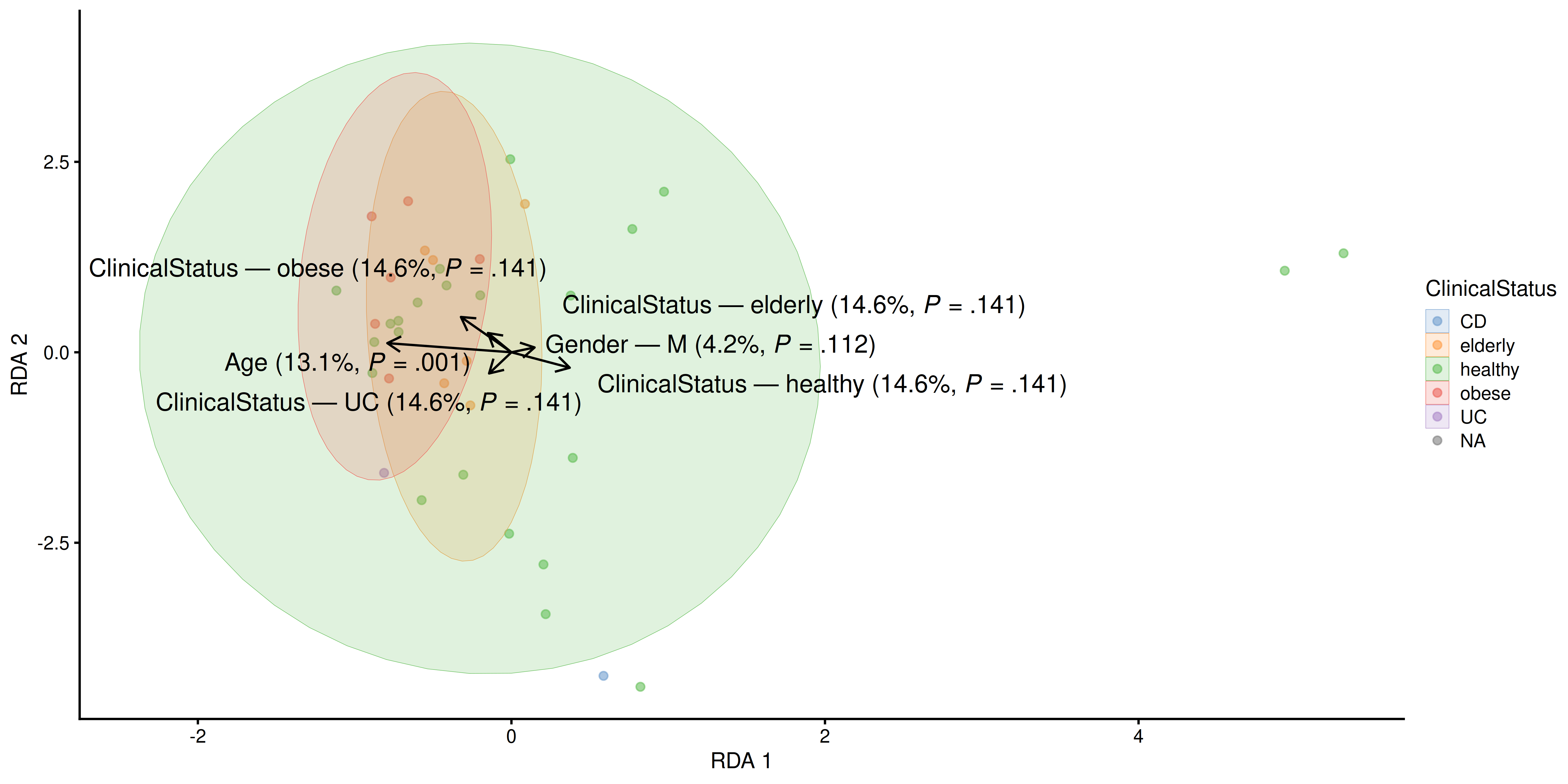
From above, we can see that only age significantly describes differences between the microbial profiles of different samples. Such visual approach complements the previous results obtained with PERMANOVA.
Calculating dissimilarities between samples is computationally demanding task, which can make methods like dbRDA or PCoA time-consuming with large datasets. To speed-up calculations, consider using functions that support parallel processing instead of the default vegan package options. Packages like parallelDist can significantly improve performance on systems with multiple available cores.
In *Dissimilarity() functions, you can specify the utilized dissimilarity function with dis.fun argument.
tse <- addDissimilarity(
    tse,
    assay.type = "relabundance",
    method = "bray",
    dis.fun = parallelDist::parallelDist
)
This same approach can also be used in PCoA.
tse <- addMDS(
    tse,
    assay.type = "relabundance",
    method = "bray",
    dis.fun = parallelDist::parallelDist
)
With dbRDA, you can use precomputed dissimilarity matrices, allowing the method to bypass the dissimilarity estimation step. This enhances efficiency and speeds up the analysis.
tse <- addRDA(
    tse,
    dis.name = "bray",
    formula = assay ~ ClinicalStatus + Gender + Age,
    na.action = na.exclude
)
15.5.2 Visualize dbRDA loadings
Let us visualize the model coefficients or loadings for species that exhibit the largest differences between the groups. This gives some insights into how the groups tend to differ from each other in terms of community composition.
plotLoadings(tse2, "RDA", ncomponents = 2, n = 20)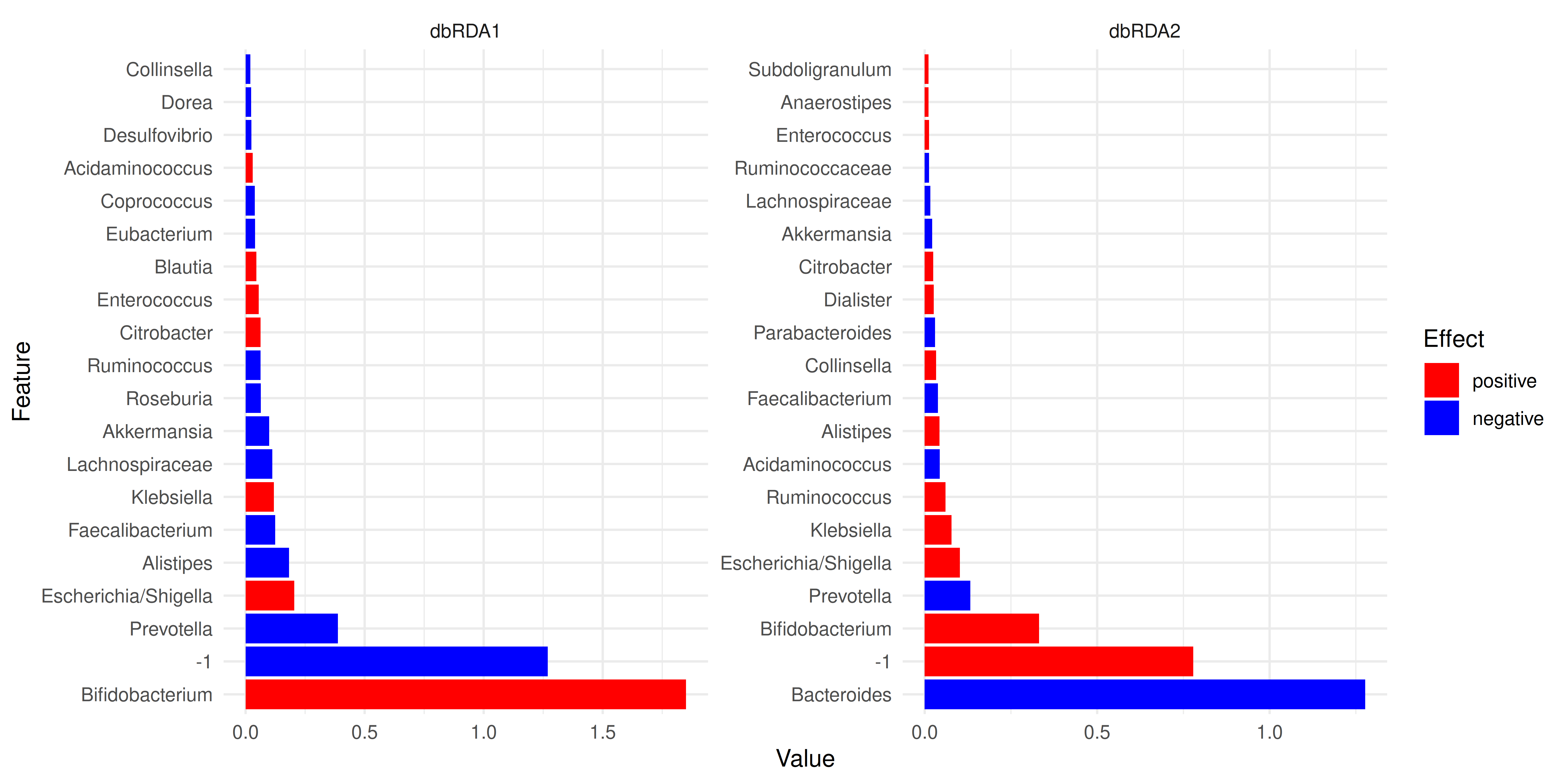
In the example above, the largest differences between the two groups can be attributed to Bifidobacterium and -1.
15.5.3 Checking the homogeneity condition
It is important to note that the application of PERMANOVA assumes homogeneous group dispersions (variances). This can be tested with the PERMDISP2 method (Anderson 2006) by using the same assay and distance method than in PERMANOVA.
To ensure that the homogeneity assumption holds, we retrieve the corresponding information from the results of RDA. None of the p-values is lower than the significance threshold, and thus homogeneity is observed.
PERMANOVA assumes that the group dispersion is homogeneous. Homogeneous dispersion means that the variation within groups is smaller than the variation between groups, making the groups distinct. If this assumption is not met, the results can be misleading.
addRDA() performs homogeneity test automatically.
rda_info$homogeneity |>
knitr::kable()| Df | Sum Sq | Mean Sq | F | N.Perm | Pr(>F) | Total variance | Explained variance | |
|---|---|---|---|---|---|---|---|---|
| ClinicalStatus | 4 | 0.2511 | 0.0628 | 2.7440 | 999 | 0.102 | 1.0288 | 0.2440 |
| Gender | 1 | 0.0103 | 0.0103 | 0.4158 | 999 | 0.533 | 0.9283 | 0.0111 |
| Age | 29 | 0.3272 | 0.0113 | 17.0255 | 999 | 0.406 | 0.3319 | 0.9860 |
As the group dispersion is homogenic, PERMANOVA can be seen as an appropriate choice for comparing community compositions.
15.6 Case studies
15.6.0.1 Visualizing the most dominant genus on PCoA
In this section, we visualize the most dominant genus on PCoA. A similar visualization was proposed by (2021). First, let us agglomerate the data at the Genus level and identify the dominant taxonomic features for each sample.
# Agglomerate to genus level
tse_genus <- agglomerateByRank(tse, rank = "Genus")

# Convert to relative abundances
tse_genus <- transformAssay(
    tse, method = "relabundance", assay.type = "counts")

# Add info on dominant genus per sample
tse_genus <- addDominant(
    tse_genus, assay.type = "relabundance", name = "dominant_taxa")
# Overview
summarizeDominance(
    tse_genus, rank = "Genus", digits = 3, name = "dominant_taxa")
##  # A tibble: 16 × 3
##    dominant_taxa                n rel_freq
##    <chr>                    <int>    <dbl>
##  1 Bacteroides                  5     0.2
##  2 Crenothrix                   3     0.12
##  3 Faecalibacterium             2     0.08
##  4 Prochlorococcus              2     0.08
##  5 Streptococcus                2     0.08
##  6 CandidatusNitrososphaera     1     0.04
##  # ℹ 10 more rows
Next, we perform PCoA with Bray-Curtis dissimilarity.
tse_genus <- addMDS(
    tse_genus,
    FUN = getDissimilarity,
    name = "PCoA_BC",
    method = "bray",
    assay.type = "relabundance")
Finally, we get the top taxonomic features and and visualize their abundances on PCoA.
# Getting the top taxa
top_taxa <- getTop(tse_genus, top = 6, assay.type = "relabundance")

# Naming all the rest of non top-taxa as "Other"
most_abundant <- lapply(
    colData(tse_genus)$dominant_taxa, function(x){
        if (x %in% top_taxa) {x} else {"Other"}
    })

# Storing the previous results as a new column within colData
colData(tse_genus)$most_abundant <- as.character(most_abundant)

# Calculating percentage of the most abundant
most_abundant_freq <- table(as.character(most_abundant))
most_abundant_percent <- round(
    most_abundant_freq / sum(most_abundant_freq) * 100,
    1)

# Retrieving the explained variance
e <- attr(reducedDim(tse_genus, "PCoA_BC"), "eig")
var_explained <- e / sum(e[e > 0]) * 100

# Define colors for visualization
my_colors <- c(
    "black", "blue", "lightblue", "darkgray", "magenta", "darkgreen", "red")

# Visualization
p <- plotReducedDim(tse_genus, "PCoA_BC", colour_by = "most_abundant") +
    scale_colour_manual(
        values = my_colors,
        labels = paste0(
            names(most_abundant_percent), "(", most_abundant_percent, "%)")) +
    labs(
        x = paste("PC 1 (", round(var_explained[1], 1), "%)"),
        y = paste("PC 2 (", round(var_explained[2], 1), "%)"),
        color = "")

p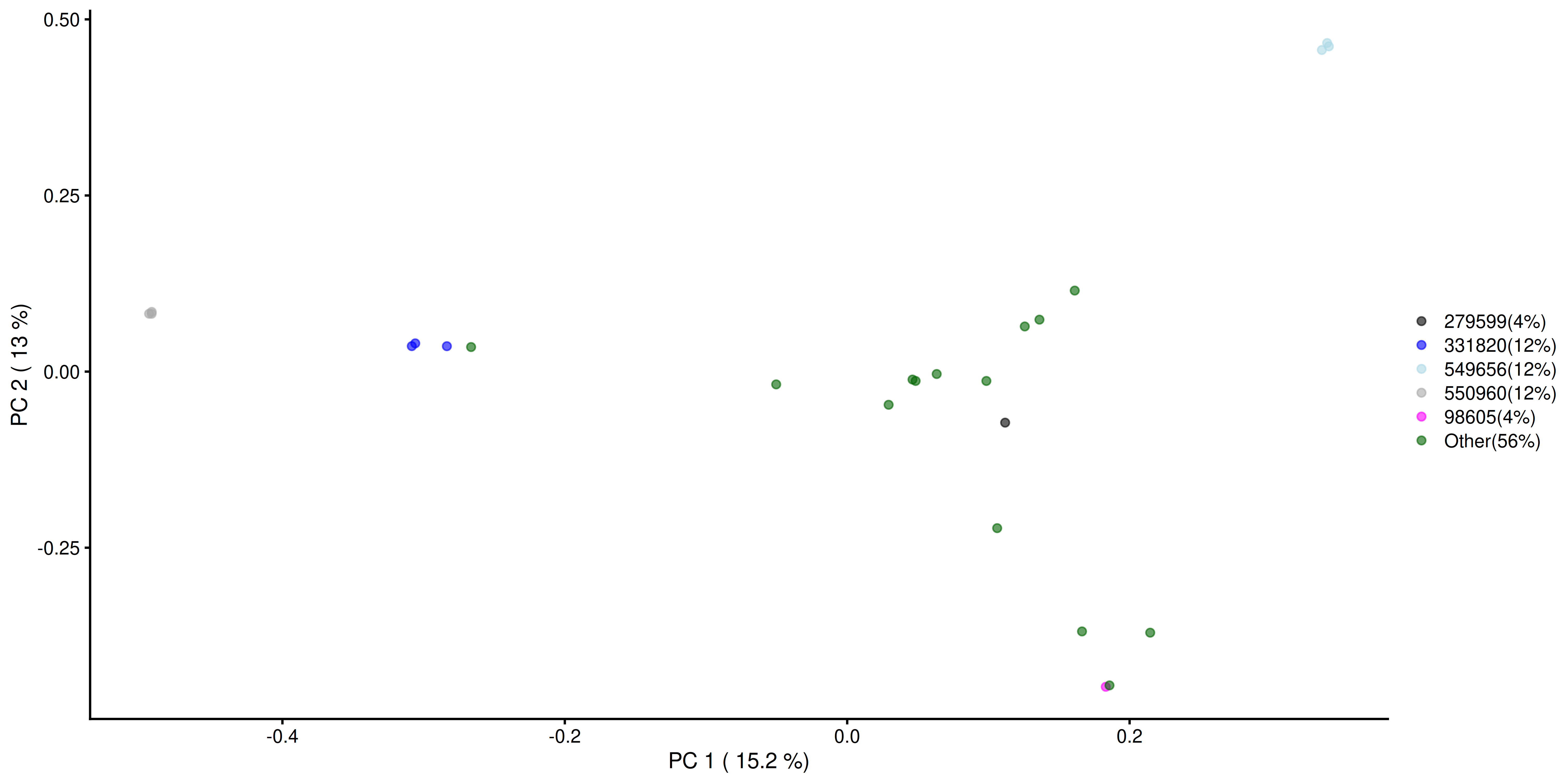
Similarly, we visualize and compare the sub-population.
# Calculating the frequencies and percentages for both categories
freq_TRUE  <- table(as.character(most_abundant[tse_genus$Group]))
freq_FALSE <- table(as.character(most_abundant[!tse_genus$Group]))
percent_TRUE  <- round(freq_TRUE  / sum(freq_TRUE)  * 100, 1)
percent_FALSE <- round(freq_FALSE / sum(freq_FALSE) * 100, 1)

# Visualization
plotReducedDim(
    tse_genus[ , colData(tse_genus)$Group == TRUE], "PCoA_BC",
    colour_by = "most_abundant") +

    scale_colour_manual(
        values = my_colors,
        labels = paste0(names(percent_TRUE), "(", percent_TRUE, "%)")) +

  labs(
      x = paste("PC 1 (", round(var_explained[1], 1), "%)"),
      y = paste("PC 2 (", round(var_explained[2], 1), "%)"),
      title = "Group = TRUE", color = "")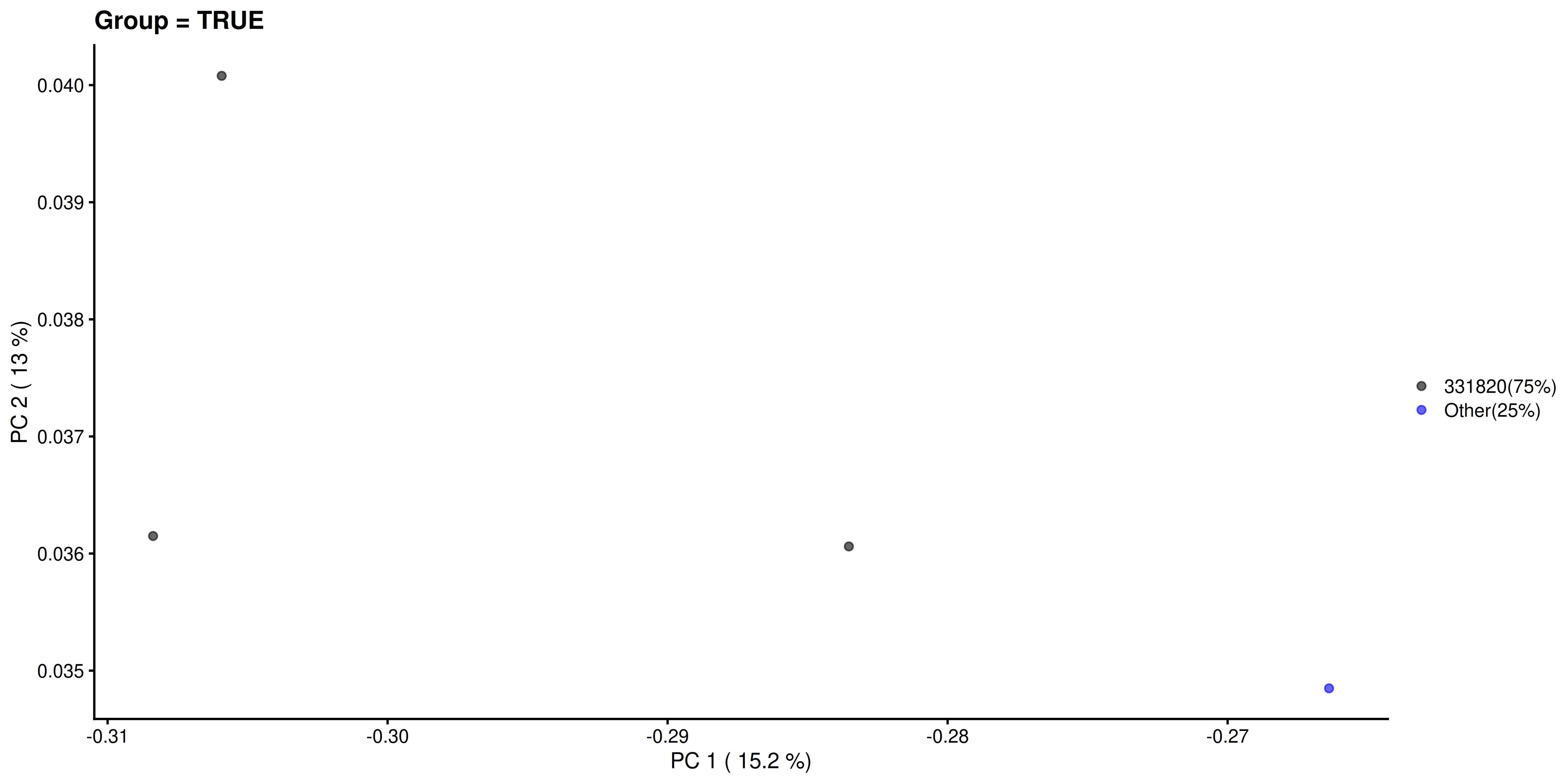
plotReducedDim(
    tse_genus[ , colData(tse_genus)$Group == FALSE], "PCoA_BC",
    colour_by = "most_abundant") +

    scale_colour_manual(
        values = my_colors,
        labels = paste0(names(percent_FALSE), "(", percent_FALSE, "%)")) +

    labs(
        x = paste("PC 1 (", round(var_explained[1], 1), "%)"),
        y = paste("PC 2 (", round(var_explained[2], 1), "%)"),
        title = "Group = FALSE", color = "")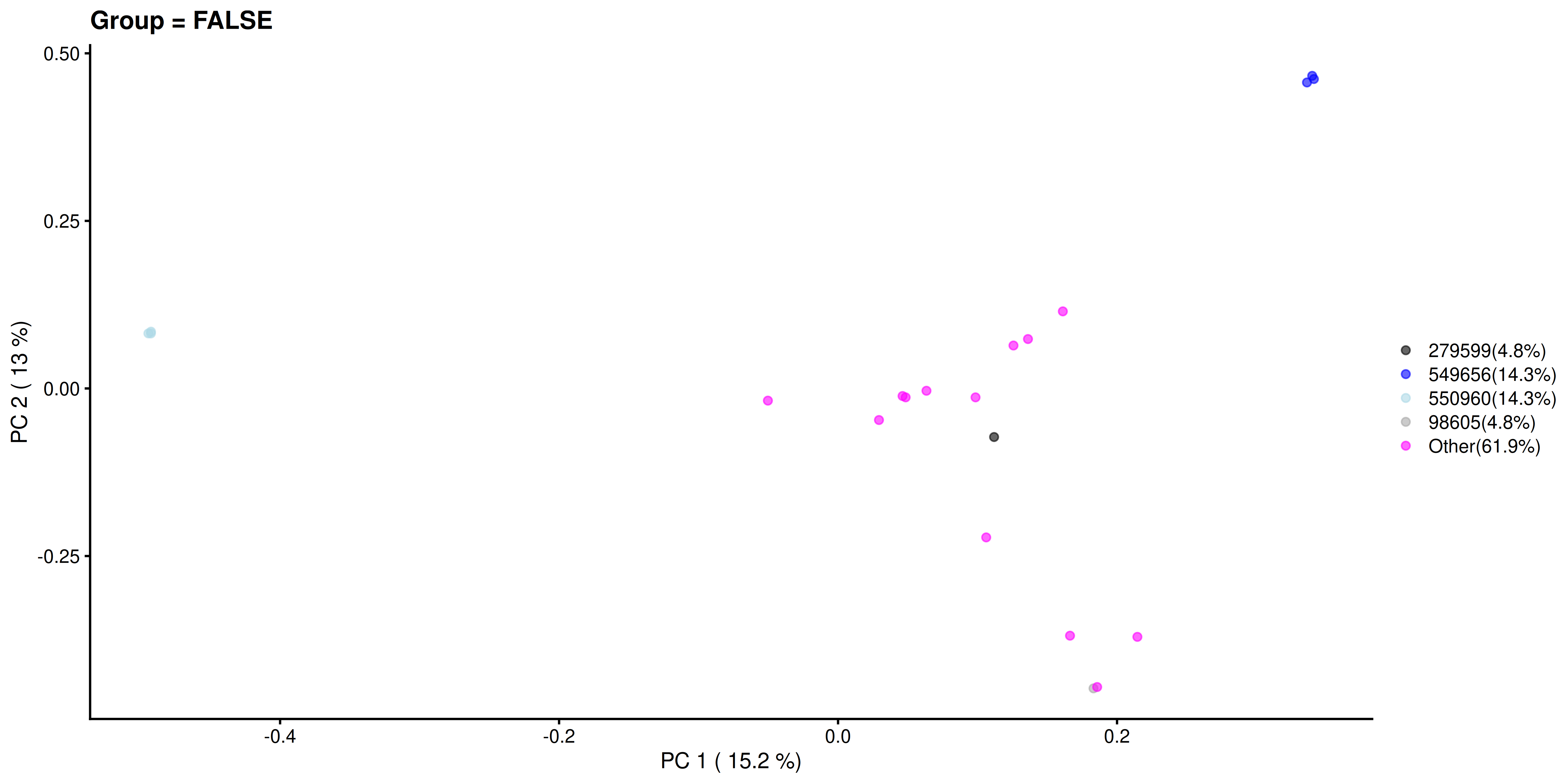
As a final note, we provide a comprehensive list of functions for the evaluation of dissimilarity indices available in the mia and scater packages. The calculate methods return a reducedDim object as an output, whereas the run methods store the reducedDim object into the specified TreeSE.
- Canonical Correspondence Analysis (CCA):
getCCA()andrunCCA() - dbRDA:
getRDA()andrunRDA(0); our recommended default method to assess differences in community composition (beta diversity) - Double Principal Coordinate Analysis (DPCoA):
getDPCoA()andrunDPCoA() - Jensen-Shannon Divergence (JSD):
calculateJSD()andrunJSD() - MDS:
getMDS()andaddMDS() - NMDS:
getNMDS()andaddNMDS() - Overlap:
calculateOverlap()andrunOverlap() - PERMANOVA: (e.g. from
vegan::adonis2()) can be used to assess significance when comparing community composition between groups. Retrieving the loadings and components is more tricky, however. - t-distributed Stochastic Neighbor Embedding (t-SNE):
calculateTSNE()andrunTSNE() - UMAP:
calculateUMAP()andrunUMAP()
For more information on sample clustering, you can refer to:
- How to extract information from clusters
- Chapter Chapter 16 on community typing